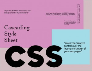
While creating the word definition sheet, I wanted to make the acronym the biggest on the page. I wanted the letters to be sans-serif, but not stiff looking. The font I chose to emulate how I interpret Cascading Style Sheet is “Coradium” which I felt look more rounded, but still formal. The other two fonts I chose were “Sathu” and “Cochin.” I wanted a serif font to offset the primary sans-serif font. “Chochin” wasn’t as thick and rounded as the serif font I normally use and felt like a good fit overall. “Sathu” is a sans-serif as well, but I thought complemented “Coradium.” I also looked for readability on screen while choosing my fonts. The color scheme is subdue and isn’t normally my style, but it felt right for the piece given the font. For the most part, I get a sixties/seventies vibe on the overall piece. I chose three definitions, one from the book, one from the internet, and my own definition.
