Term | Type
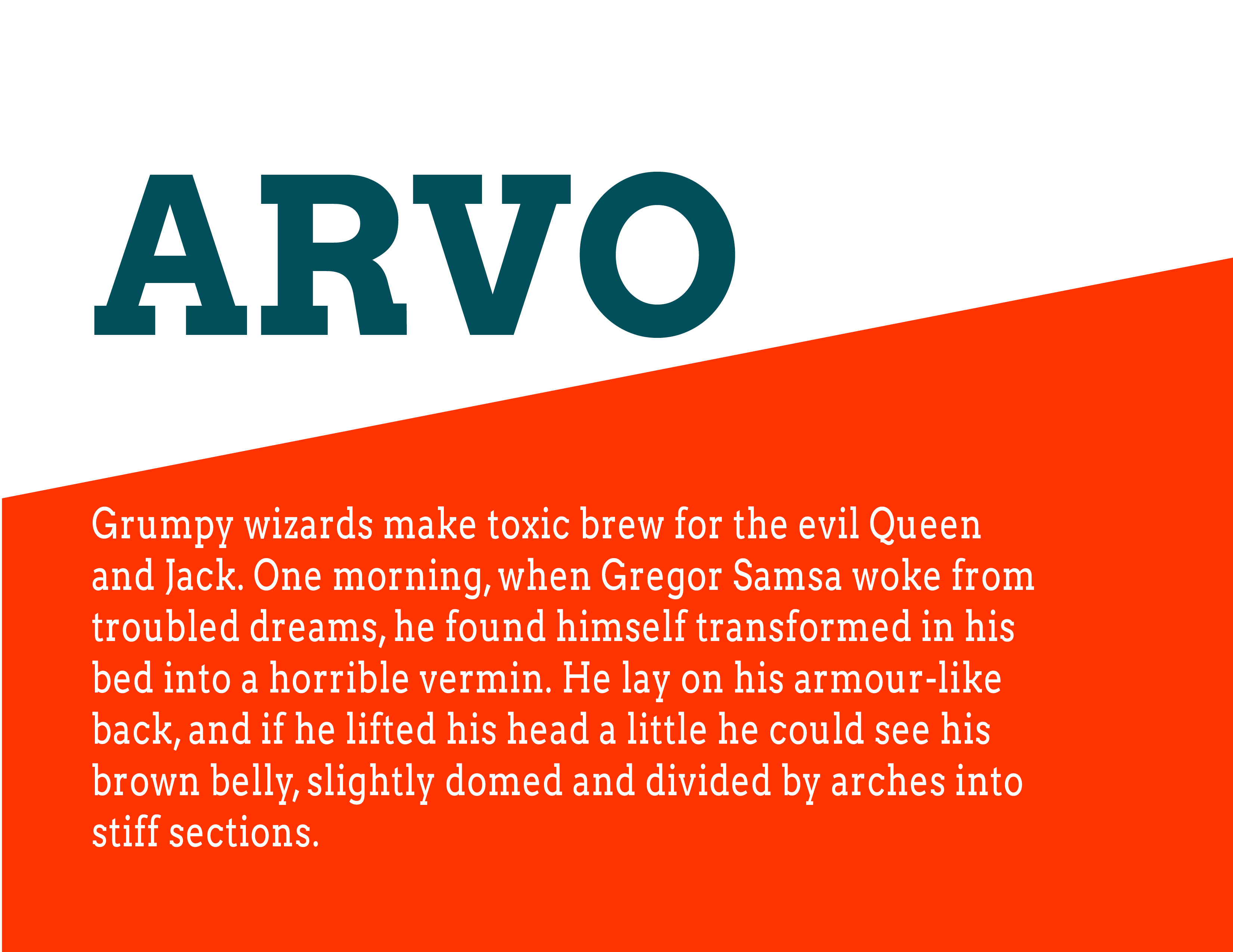
Arvo is a slab-serif font created by Anton Koovit especially for Google Fonts. Arvo is just one of eight fonts that Koovit has created. Although, most commonly used as a header or sub-header, Arvo makes a very legible body font because it’s monolinear. As a header or sub-header, Arvo is noted to go well with a sans serif.
Reading | Chapter 7
As I was reading I really started to realize what I could do and what I really should not do. Just because I can add a decorative border – should I add a decorative border? Even giving an empty space the wrong color could really distract a reader. Leaving white space is beneficial. It gives the viewer room to breath. Adding effective padding is also key to a successful page. On the other hand, I think letting an image with large type (if any) take up the whole page with no margins could be really beautiful. 