Technology

webtypography.net

Posted by | Aubrey Samson, Technology | No Comments

1/25/16

Reading

After learning justttttt a little bit about coding, i started to play around a bit and was thinking to myself, how would i do this, or that? Theres gotta be an answer, but im such a noob! After reading chapter 3, one of my questions was answered. If i have a particular tag that has a certain css, and i need to have one of those tags have a different style, how would i approach this? The answer is class selectors! After doing the tutorial i still was a little confused on where to put the selector and so fourth, but i know with more practice it will click.

Throughout the chapter they also explained how the family tree works, and explained what ancestors, descendents, parents, children, and siblings refer to. This will be helpful when i am trying to build a descendent selector, because i will need to know what that specific tags ancestor is.


Technology

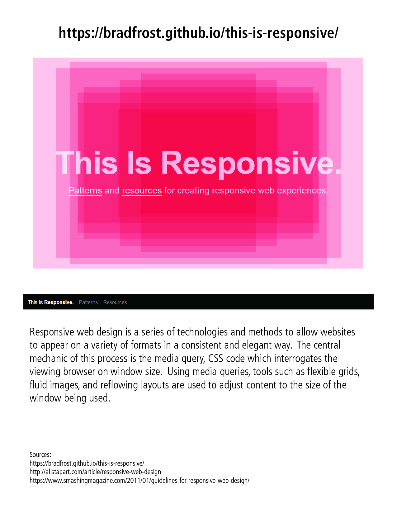
This technology, associated with the word responsive typography, translates a classic graphic design paramount into a new formula applied specifically for the web. The book “Elements of Typographic Style” originally written by Robert Bringhurst was applied to the web by UX designer Richard Rutter. This is a helpful tool for designers who are more knowledgable in print typography, using an classic that typically understood by designers today.

GRPH325_Samson_Aubrey_webtype

1/20/16

Posted by | Olivia, Technology | No Comments

For technology, I had IDEO. (pronounced “eye-dee-oh”. IDEO is a global design company that was founded by David Kelly. Their main focus as a design firm is to create impact through design.

IDEO helps different organizations and brands with their products, services, and experiences making them have an impact on their audience. They have capabilities and expertise in many subjects including: Brand, Engineering, Organizational Design, Business Design, Financial Services, Digital Experiences, and the list goes on and on.

IDEO serves many locations in the United States and out including Chicago, New York, Boston, London and Shanghai.

IDEO’s website: www.ideo.co

PAGE 3

January 20, 2016

Posted by | Shawnee Johns, Technology | No Comments

I thought that the Code Academy as well as the Lab was really helpful.  I learned a lot about the external and internal CSS that way, as well as inline.  It’s hasn’t been as difficult as I imagined it was.  Overall, there are just multiple steps that a time consuming.

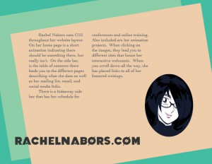
Rachel Nabors is a very talented creator.  It’d be nice to, eventually, learn how to incorporate animations into our future websites.  I think the most confusing part was how to interact with her web comic.  There weren’t any directions that I could see and I didn’t really know what the objective of the interactive part was.  Otherwise, most of the site was fairly straight forward.

johns_interactivedesign_technology_2016

Presentation

johns_interactiondesign_csspresentation_2016

Smashin’ content on the daily

Posted by | Ali Syafie, Technology | No Comments

smashing

Smashing Magazine, is a German-based website and online book publisher that provides content surrounding a range of digital topics. Founded by Vitaly Friedman, Smashing Mag mainly focuses on providing professional resources for Web Designers and Developers.

The website has six categories which their online content evolves around; Coding, Design, Mobile, Graphics, UX Design, and WordPress. Basically covering almost all aspects of web design, they have articles from colour arrangement to the language of code. All these categories are also covered in workshops ran by Vitaly himself, who graduated from Saarland University, studying Computer Science and Mathematics . More than just an online-content provider, Smashing Mag not only publish and sell books, but they provide and in-depth background about their products, and not to mention, in a fully responsive and beautiful website.

Hence mainly being a magazine, their website also has job listings from anywhere in Europe to the States.

Screen Shot 2016-01-25 at 1.40.47 PM

Smashing Page

Smashing Mag

Web Tools for Type

Posted by | Charles Wetzel, Technology | No Comments

Universal Type is that ever-evolving definition of what type can do, be, or will become. I find that while researching and clicking through these sites centered on type, things are changing so fast. Developments in software and networking are making branched connections that loop you around to many places you wouldn’t expect to go. Defining the concept of Universal Type seems more ludicrous each day. Maybe it more of something to experience rather than define.

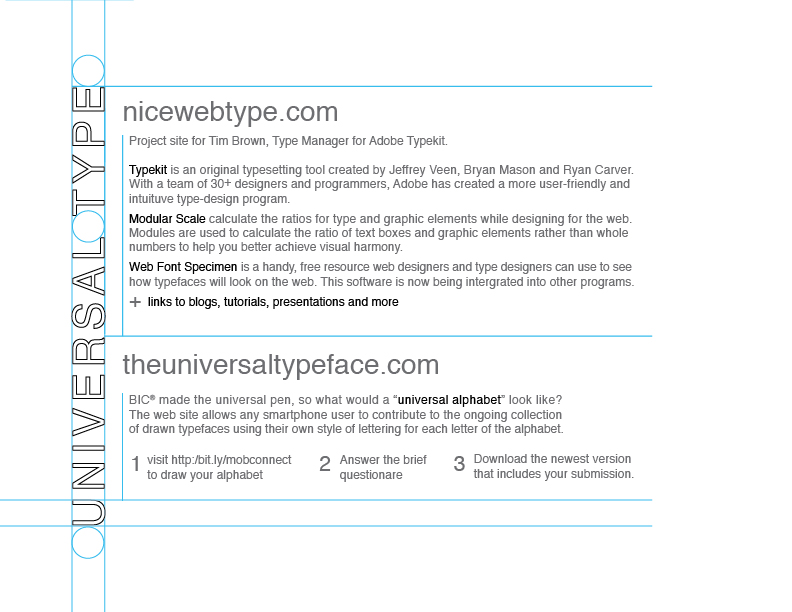
Two websites that are approaching this broad idea come from two very different places, with two very different goals to achieve. And yet, they both have this overarching theme of a universal-human-input-to-letter-form and how we will interact with type.

nicewebtype.com is a central hub of type created by Tim Brown, Type Manager for Adobe Typekit. On this site, Tim has links to the software projects he has been developing with and outside of Adobe. He has websites and software for modular scaling, type design and more. He also has links to tutorials, videos, presentations and more things related to type. While it’s his site, you can tell right away he is very transparent about how much he collaborates with other professionals. And here is the key to unlocking the ephemeral Universal Type mystery: cross-collaboration with as many like-mind designers to illustrate some sort of creative consensus as to what everyone wants/needs/dreams-of for type now and in the future.

theuniversaltypeface.com takes this concept in a very different direction. BIC, the company that gave you the ubiquitous ball-point pen, has created an interactive website that lets you sync up with a smartphone and draw the alphabet. Why? BIC wants to know what a “Universal Typeface” would like, so they are collecting submissions of peoples’ hand-drawn alphabets and averaging the shapes/orientations to created an aggregate-style that is updated daily. This style can then be downloaded and used on your device. Submit your style and join the experiment!

Universal Type TECH

January 20, 2016

Posted by | Collin Rasmussen, Technology | No Comments

Technology

Lukew.com is a website users would use to navigate and explore to learn about writings from Luke Wroblewski. Luke is an Interface Designer who focuses mostly on Mobile First (a strategy Luke uses and advises using when programming web pages), Web Form Design and Web Usability. He seems to have taken a more revolutionary approach to programming and web designing which has lead him to many accomplishments.

He uses large collections of data to help other programmers and designers improve. A recent study by Luke has revealed that as mobile screens sizes increase… so does activity. It’s important to consider usage on different size phones/tablets. Learn more for yourself at Lukew.com!

Screenshot_01

screenshot_02

lukew