Technology

1/20/2016

Posted by | Technology, Truly Wu | No Comments

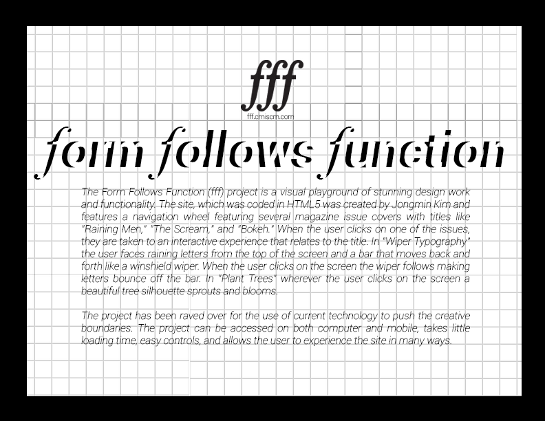
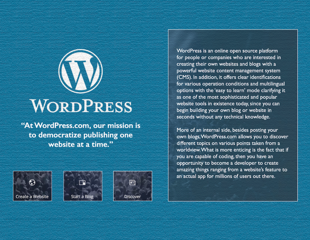
The technology I researched was www.wordpress.com. I had a lot of fun discovering it. I had used this website for blogging last semester, but didn’t realize the extended and enhanced functionality provided. I am glad to learn more about it and these discoveries ensured that it will be used effectively in my future. Essentially, WordPress is an online open source website for people or companies who are interested in creating their own websites and blogs through a powerful content management system (CMS). In addition, it offers clear identification for various operation conditions and multilingual options with the ‘easy to learn’ mode clarifying it as one of the most sophisticated and popular website tools in existence today, since you can begin building your own blog or website in seconds without any technical knowledge. Many famous blogs, news outlets, music sites, and Fortune 500 companies use WordPress. They are currently powering more than 20% of the web. Viewing www.wordpress.org, on the bottom of the page, displays their site showcasing of well-known people who use the service.

Another important option that is guaranteed to attract attention is the endless number of themes to choose from. WordPress categorizes themes for different types of people and usages, such as photography, portfolio or magazine, and, of course, you can be a badass who doesn’t follow trends and create your own. The best thing I discovered was that, besides building your own page, if you are capable of coding, then you have an opportunity to become a developer and create amazing things ranging from a website’s feature to an actual app for millions of users. WordPress also provides testing sites, resources and documentation on the all developments before you build anything. For instance, WordPress’s Rest API allows you to build applications that can manage user’s blogs.
GRPH325_Truly_Wu_Technology

January 20

Posted by | Allison Sutton, Technology | No Comments

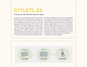
For the technology category I researched styletil.es.

This website was created by Samantha Warren who is a Design Lead at Adobe in San Francisco. She created this website to give insight to her design process, which includes the use of Style Tiles. As described in my previous post, style tiles are a way of organizing information to create a common visual language between the designer and the client. Her website breaks down how to use and create style tiles  step by step. The first step is to listen to the client through meetings and organizing surveys to distribute. Secondly, the designer takes the information acquired and turns that into a list of adjectives that will be used to help create the style tile (similar to the process of creating a mood board). Next, the designer defines the visual language. This is where Style Tiles become different from mood boards. The word “mood” is often associated with brand and identity design, so the word “style” refers t0 cascading stylesheets (i.e. web design). The visual language includes colors, text hierarchy, the way button will look, etc. The style tiles are pitched to the client in iterations and then are updated to see fit. The benefit of style tiles is that they are created without dimensions. This means that when changes need to be made, they are only made for the visuals before the design is set to be responsive to multiple devices. This saves a lot of time for the designer and reduces the amount of mock-ups that will be made.

Chapter 4 is about saving time with style inheritance. This is the process when CSS properties are applied to one tag and are passed on to nested tag. This means that if a <body> tag is given a property that all the tags inside (such as a <p> tag) will also have these properties unless otherwise noted.

StyleTiles2_Sutton

StyleTiles2_Sutton

Post #3 – Stephanie Whitsett

Posted by | Stephanie Whitsett, Technology | No Comments

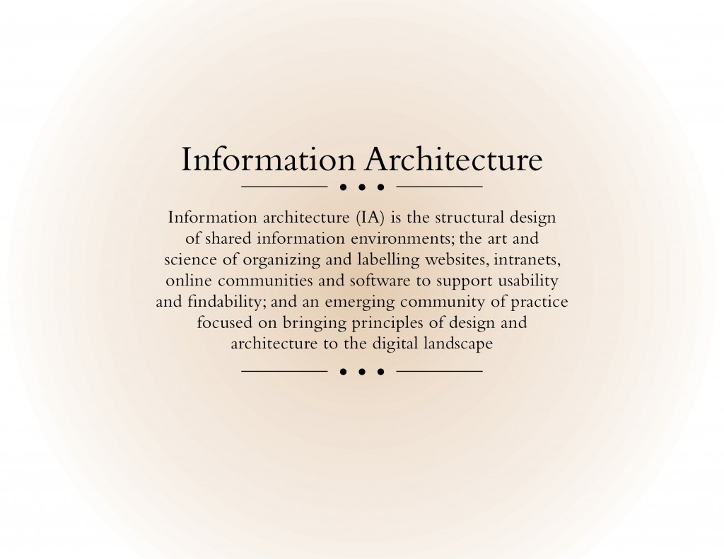
Information Architecture is as simple as helping users understand where they are, what they’ve found, what around and what to expect on an user interface!

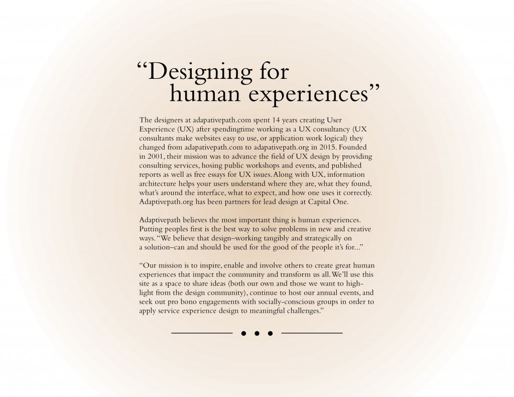
Adaptivepath.org is a pioneer in User Experience design and Information Architecture they have been designing for the human experience for over 14 years. They have been helping organizations, companies, business, and people improve their products for the consumer, through a human-based approach. Adaptivepath.org’s homepage states “Our mission is to inspire, enable, and involve others to create great human experiences that impact the community and transform us all.” Their website contains guides that have talks and different articles that help you understand them better. Their top ways of doing this are:

  • Service Design – “harmonizes every component of a service for a coherent, efficient, and enjoyable experience.”
  • Experience Strategy – “is finding and envisioning the experiences that should exist in the world.”
  • Design Management – “is the shepherding of efforts and resources to maintain the big-picture vision and health of a project itself.”

Their other guides are : Design Facilitation, Design Leadership, Design Research, Design Strategy, Experience Mapping, Visual Design.

Term:

Term Technology

Technology:

Term Technology2

1.21.16

Posted by | Leah Urbank, Technology | No Comments

Reading

The reading was as dense as usual. It was nice to see that there were tools for specific detailing for formatting the type. It makes sense that such a thing would exist, as I see the results of such work online in real life. Although as I read, I discover that I’ll probably need a cheatsheet, at least for a little while, just to keep everything straight. I wouldn’t want to start mixing things up in code, because I think that it’ll be harder to fix if that happens.

Technology Typesetting

New York Times, Snow Fall. The Avalanche at Tunnel Creek Website.


GRPH325_Urbank_Leah_TechDefinition

1/20/2016

Posted by | Ally Frame, Technology | No Comments

I had a blast exploring my selected website typetasting.com. It’s such a cool idea to take something like fonts and do experiments essentially on how people associate different fonts with other completely unrelated things. If that sounds confusing, here’s a question… Are lemons fast or slow? They’re fast. duh. That makes no sense because lemons don’t have speed, but the majority of people will answer with fast. That’s because our brain is so full of connections that it’s common for one stimulus to trigger an unrelated pathway. That’s what Type Tasting looks at, what associations we subconsciously make when we see letterforms. The website has lots of surveys to help with research but you can also play the type dating game. It’s actually really fun to imagine typefaces as people and you automatically start making up personalities. I had my roommate do it who knows nothing about design and she was making up back stories and telling me how they looked. According to past workshops, apparently most people just want to be friends with Helvetica for what it’s worth. I personally would go for Baskerville because he seems classy and intellectual and we could talk about literature all day.

But there’s also a lot of other cool research like the matching fonts to smells and different foods. Also, that the typeface on a food product can go so far as to making you believe it has fewer calories than it actually does. Also, Didot is the diamond of typefaces. It’s perceived as the most expensive and luxurious. All of this research is just so interesting and the fact that most people agree on what they associate typefaces with is crazy. Designers need to know this. They need to know the power a simple letterform can have on a consumer. It doesn’t just change their decisions but it can actually alter the way something tastes or smells or whatever. Type is crazy powerful and I think we tend to forget that a lot.

The creator, Sarah Hyndman also has a ted talk which I highly recommend. The way she speaks about type is pure poetry. The most important thing to take away from her talk, in my opinion, is that FONTS TURN WORDS INTO STORIES. We don’t think about it, but every time we look at a font we automatically create a backstory and instant associations. Now that I’m thinking about this I can’t stop thinking about what type is saying to me.technologyType


January 25, 2016

Posted by | Emma deVries, Technology | No Comments

For Technology I have researched Typekit, an online service that is currently owned by Adobe and was co-created by Jeffery Veen.  Typekit was launched in 2009 before being purchased by Adobe in 2011.  The online library of web safe font has revitalized typography.

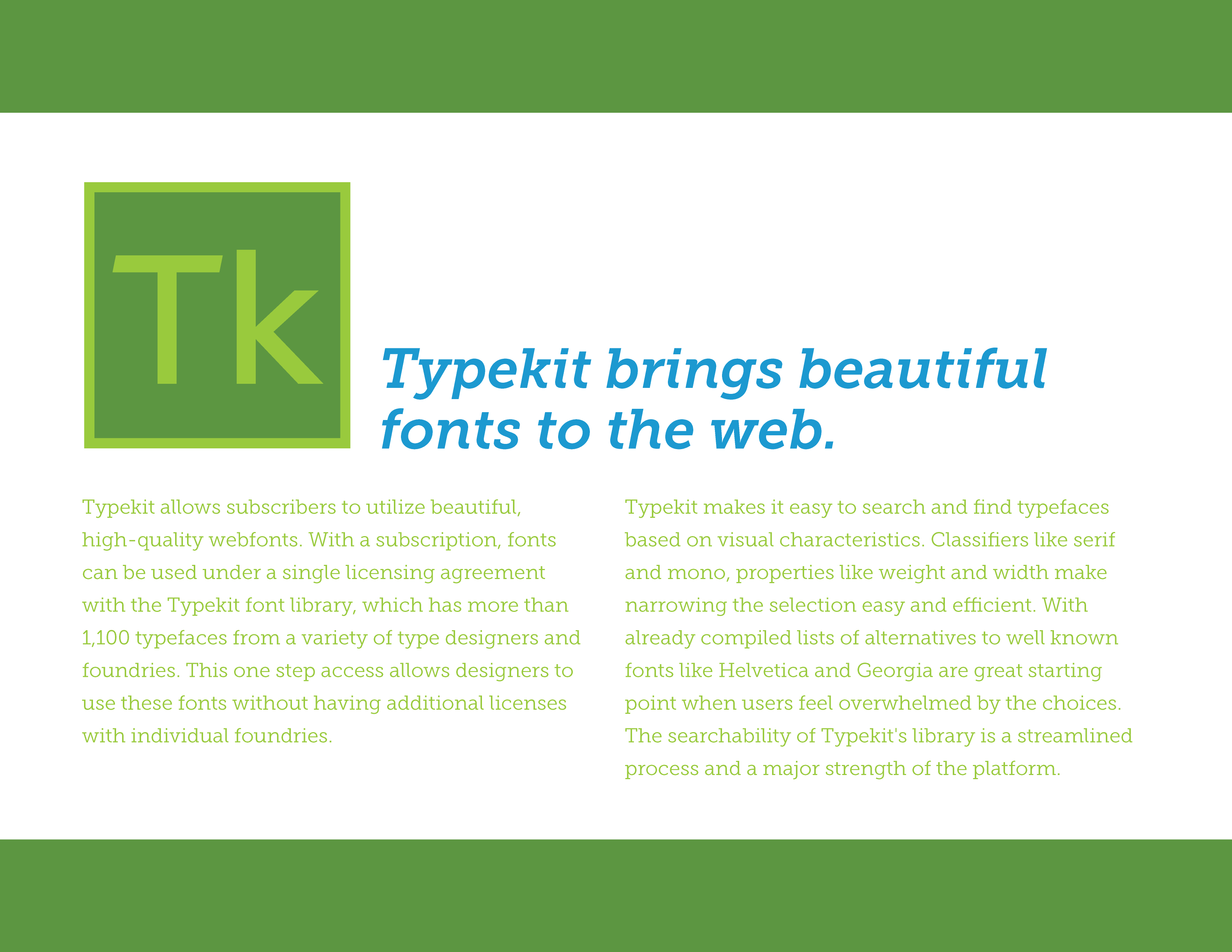
Typekit allows subscribers to utilize beautiful, high-quality webfonts. With a subscription, fonts can be used under a single licensing agreement with the Typekit font library, which has more than 1,100 typefaces from a variety of type designers and foundries. This one step access allows designers to use these fonts without having additional licenses with individual foundries.

Typekit makes it easy to search and find typefaces based on visual characteristics. Classifiers like serif and mono, properties like weight and width make narrowing the selection easy and efficient. With already compiled lists of alternatives to well known fonts like Helvetica and Georgia are great starting point when users feel overwhelmed by the choices. The searchability of Typekit’s library is a streamlined process and a major strength of the platform.

When I have been designing these definition pages I used Typekit to find a typeface that blended the beauty of print based type with technology.  I decided on Museo Slab because of the variation within its font family and its strong  characteristics. The closest webfont on Google Font is Slabo 13px, which doesn’t have any variation and is on the thicker side.  Hopefully the change won’t be that dramatic in the final iteration!


Early homepage of Typekit highlighting how revolutionary webfonts will be for designers and the future of web design.


typekit-02

Typekit’s new logo is now compatible with the look and feel of Adobe, although the subscription service is still available without purchasing further Adobe software.

1/20 Technology

Posted by | Michael Johnson, Technology | No Comments

The Team W, founded by Susan Weinschenk, is a company that offers very specialized business consulting services. Weinschenk, a Ph.D.in psychology, uses her knowledge of brain science and behavioral science to understand and direct online users. The services The Team W offers are threefold: in addition to using established and well-researched psychology engineering methods to predict user behavior they also focus on business growth and in-bound marketing. They teach businesses how to use software and web design to influence the subconscious mental processes we all go through.

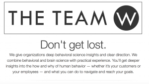
They focus on helping businesses plan and achieve strategic, long-term marketing objectives. Their website exemplifies what Weinschenk identifies as two of the most important drivers: the need to belong, and story telling.Screen Shot 2016-01-23 at 8.56.05 PM

The Team W’s site design is wide and open. Users are greeting with short blurbs of large, friendly text, that are easy to quickly read. The kind tone of the blurbs seems welcoming and eager to oblige the visitor. “DON’T GET LOST,” seems like the words of a friend. As the user scrolls down, the story telling begins, as they first learn about the website from a short interview with Weinschenk herself. Users can scroll down even further and see the types of services that The Team W provides and how to access them. The whole feel is clean, intriguing, and approachable.

Citations:

  1. http://www.theteamw.com/#
  2. https://www.facebook.com/TheTeamW/info/?tab=page_info
  3. http://davidmannheim.co.uk/blog/interview-dr-susan-weinschenk/
  4. http://www.stateofdigital.com/interview-susan-weinschenk-emetrics-conference-london/

R/GA

Posted by | Huy Tran, Technology | No Comments

R/GA is a design agency that was found in 1977 as a production company. The company considered it is “agency for the digital age”.

The company model is an original model, with is built from the ground up to meet the business need. The model of the company is also the one that make R/GA different from other agency.

R/GA model is consisting of 7 discipline, which then divided into 3 group. The first group is strategic discipline, which is included planning, analytics and media. The second group consist of 3 creative discipline, which is included interaction design, copy writing and visual design. The final group is actual consist of technology discipline.

Second reason that make R/GA unique is that account management work side by side with the production. The reason for this is that R/GA produce almost anything that they able to execute from their plan, which can be a complex software some time.

Third reason that makes the company different from other agency is the company production. The company have there own in house digital studio. This is a really good idea because with the in house studio, they are able to provide to their client with high quality with low cost product.

When I research about there work, I find it interesting to learn more about how they come up with their design. According to the company, a “story is hollow without a behavior, and a behavior is dry without a story”. I interpret this quote as a good story inspires people to behave a certain way, and a behavior is not god one if there is no story behind it, and I can see they apply it to their work. One of the works that they talk about is the Nike+. Runner around the world fuels the Nike+. The app collects the data for the runner, and shares it with other runner around the world. Another work that is an example for design that fueled by campaign R/GA talk about is their website Thatsnotcool.com. The purpose of the website is to combat the digital harassment. Since we cannot preach to the audience, the company decided to help them understand the issue first, and then let them drawn there own conclusion. In order to do this, the system that they design included interactive video, callout card, forum, social network content, and mobile app. However, nobody know about this, so R/GA decided to create a campaign, which is include the awareness session on TV, banner Ad, poster on in the public, and Google search optimization.

Love Has No Labels is another R/GA work that I really like. There work is truly a piece of performance art, with combine between technology and human. I feel like the making of the LED screen is not to hard for them to make, I was more impress at the idea, of how can they can have such a good plan.

Here is the video to the Love Has No Labels campaign: https://vimeo.com/121388342

RGA