Terms
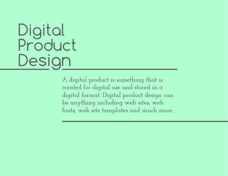
My definition was digital product design. It’s pretty easy to understand what it is, but finding a definition or people talking about how to describe it was kind of difficult so it made it kind of hard to come up with a definition for it. But I think I explained it well and in an easily understandable way.
CSS
Chapter 2 :
We read about style sheets–which each contain a selector and declaration block. Each declaration contains a property and a value. i.e. {color:red}. A collection of styles compromises a style sheet (sounded similar to paragraph and character styles in inDesign). There are two types: internal and external style sheets. Internal are not as efficient because you need to cpoy and paste the style into each page of the site, unlike external style sheets. This is a major time saver.
Style Tiles
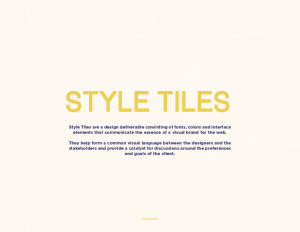
Style tiles are a design deliverable that contain fonts, colors, and elements that communicate the essence of a visual brand for the web. A moodboard is too vague and a mockup is too precise, making style tiles just right. They help to form a visual language between the designers and who they are designing for, and it acts as a catalyst for discussions around the preferences and goals of a client needing a webpage.
Style tiles establish a direct connection with actual interface elements without defining the layout. They present clients with interface choices without doing multiple photoshop mockups. Unlike a moodboard, which has an emphasis on the brand and identity design, style tiles looks to mirror “cascading stylesheets” and reinforce ideas specific to web design. (source: http://styletil.es/)
StyleTiles_Sutton < larger image
Chapter 02 | Creating Styles and Style Sheets
Styles can get really big and confusing, cause frustration, and may be the reason you’re buying a new laptop. That is why a bunch of smart people built little systems to make them easier to read. Styles are necessary CSS codes when adjusting anything from the color of the header to the size of the paragraph’s type. When you complete a sheet full of codes, you got yourself a style sheet. There are two types of these – External and Internal. When you want an easier way to build your website or if you want to update your website faster, it would be smart to go with an External style sheet. Internal style sheets are less efficient, however they do make adding a webpage easy.
Class Work
Learning how to code using the Code Academy will be something I have always wanted to do, but just could not find the time to do. As I start of learning the basics I find it relaxing and, in a way, mindless. I definitely love to design hands on a lot better but I am excited to see what neat tricks I can learn along the way.
Research | Mobile First
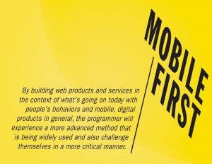
Mobile first, according to Luke Wroblewski, is “a way to start thinking about building web products and services in the context of what’s going on today with people’s behaviors and digital products in general”. Whether you want to build a mobile platform or not, it makes sense to build a mobile version first even if you do not end up launching it. Use this advice not only because your competition will (growth = opportunity), but because you can bring these files back to your desktop to begin with web development. Wroblewski (co-founder of mobile first) stress’s that while beginning with the constraints of a mobile platform, you will be forced to focus harder because of the small screens and slow connections. There are lots of new and fun capabilities to play around with in mobile that have not hit the desktops yet. Overall when thinking mobile first you must keep in mind things like multiple screen sizes, or device capabilities. After studying in depth, mathematical and scientific solutions and applying this to your product, you could feature advanced works and present an impressive development.
While finishing codeacademy, I realized how much it helped after going over the readings again.
Now after doing more codeacademy, and going over the readings I’m finally starting to understand all of this.
Chapter 2 of the missing manual begins to go over the basics of CSS, I learned a style is made up of 2 elements: the selector, which is the webpage element that the browser formats and the declaration block, which is the actual formatting instructions. For example, selectors can be headline, paragraph, photo, etc. While a declaration tells that selector to do something ex. (make it blue, add red border, etc.)
I learned style sheets can be Internal or External
Internal style sheet: collection of styles that’s part of the web page’s code. It appears between opening and closing HTML style tag.
External style sheet: a text file containing all your CSS rules, never contains HTML
Overall, the basics of CSS are starting to make sense to me.
My Term WireFrames is like a skeleton guide for all websites. They set up the space for awesome design basically.

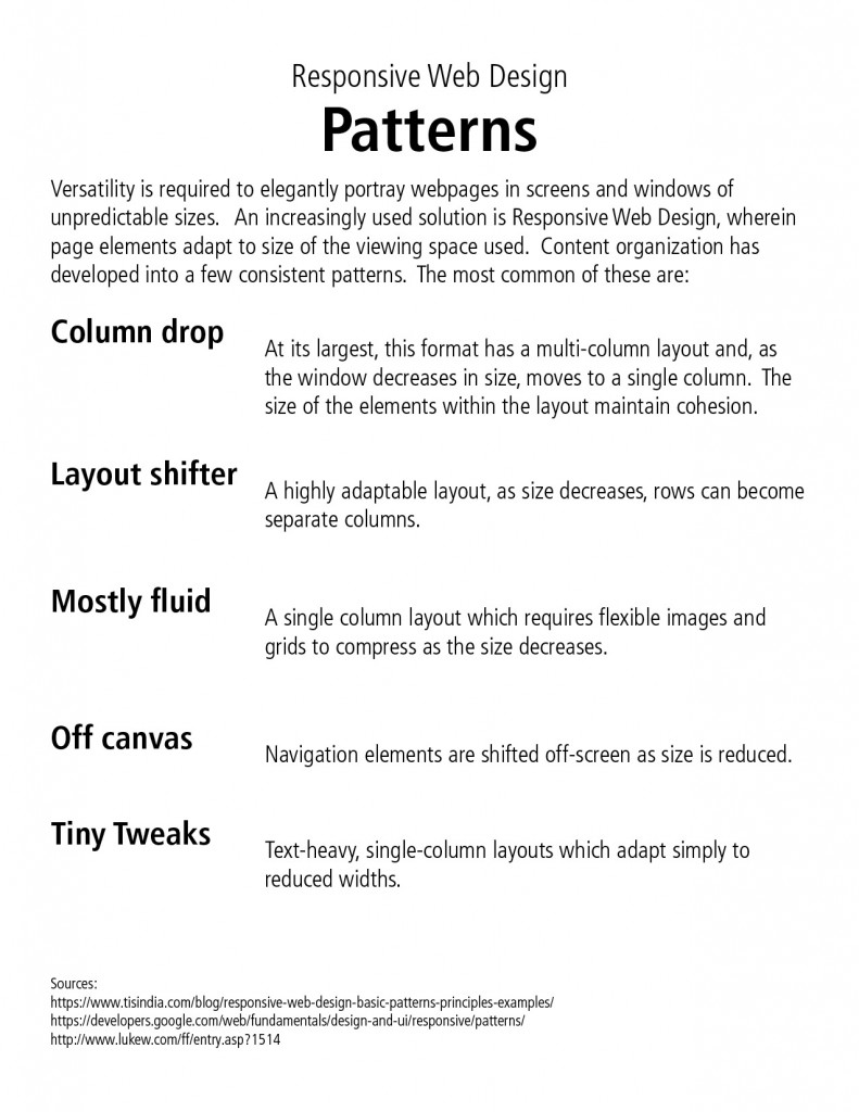
Responsive Web Design Patterns
Versatility is required to elegantly portray webpages in screens and windows of unpredictable sizes. An increasingly used solution is Responsive Web Design, wherein page elements adapt to size of the viewing space used. Content organization has developed into a few consistent patterns. The most common of these are:
- Column drop – At its largest, this format has a multi-column layout and, as the window decreases in size, moves to a single column. The size of the elements within the layout maintain cohesion.
- Layout shifter – A highly adaptable layout, as size decreases, rows can become separate columns.
- Mostly fluid – A single column layout which requires flexible images and grids to compress as the size decreases.
- Off canvas – Navigation elements are shifted off-screen as size is reduced.
- Tiny Tweaks – Text-heavy, single-column layouts which adapt simply to reduced widths.
Sources:
https://www.tisindia.com/blog/responsive-web-design-basic-patterns-principles-examples/
https://developers.google.com/web/fundamentals/design-and-ui/responsive/patterns/
http://www.lukew.com/ff/entry.asp?1514
Behavior design is a design methodology that applies behavioral psychology to the design of products to make them more engaging to people. The idea is that by using psychology, specifically behaviorism which focuses on what makes us act a certain way, we can design products that are overtly or subconsciously more appealing to customers, or more efficiently meet their needs.
Susan Weinschenk is a behavioral psychologist whose work focuses on design and user experience. She is the founder of The Team W, which gives consulting to companies and designers looking to apply behavioral psychology, brain science, and design to their work.
For instance, one study Weinschenk writes about on The Team W Blog is how color effects behavior, specifically red and blue. Read the whole article here. Done at the University of British Columbia, several fairly comprehensive tests were done, and the results of which Weinschenk analyzed and presented her conclusions about the cultural relevance of red and blue:
Here are my take-aways from this research:
-
If you are using a negative or fear message it will be more impactful if you use the color red. If you are using a positive message then use blue.
-
If you want people to do a detail-oriented task use a red background. If you want them to be creative use a blue background.
-
If you are highlighting detailed features of a product your message will be more persuasive if you use a red background. If you are highlighting concepts of how to use the product then the message will be more persuasive with a blue background.
-
People prefer blue backgrounds over red, even though red might make them get a task done more quickly. They are not aware of the effects that the colors are having.
As you can see, the different effects of the colors (creativity vs speed, fear vs positivity, and methods of persuasion, etc) seem like very useful things to know as a designer. Behavioral design helps designers tailor their their message and it’s vehicle even more specifically to their audience.
Sources:
As I have previously stated in an earlier blog, design strategy helps businesses understanding what they want to make, why they want to make it and how to visually make it appealing to its audience while contextually designing it for a positive for the business in both the short term and in the long term. Design strategy involves both the business strategy and what the business as a whole wants to achieve as well as involving the strategies of design to help the business reach these goals.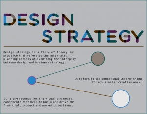
In Class
Wednesday was a content packed class. I enjoyed the mixture of learning material, from the book to Code Academy I definitely learned a lot. When everything is going well, coding can be very calming. The opposite is also true though so I am grateful that we are gaining a basic understanding of how coding functions and why it operates the way it does.
Research
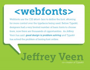
For the first project I am excited to explore Webfonts, Jeffery Veen and www.Typekit.com. Before Typekit and other services that link type on a website to the correct typeface, designers were limited to using still files or GIFs of their desired type. When a page is coded the typeface is specified, the typeface is embedded and then the page is then viewable from a visitor’s computer. The problem comes from the fact that this unfortunately breaks several copyright laws about distributing intellectual property. That’s where Jeffery Veen’s Typekit comes in. Typekit was created in 2009 to allow designers access to beautiful type for the web, all it takes is a subscription. Although there are other platforms that offer webfonts (Google, Fontdeck, font.com) the Typekit’s connection to Adobe and revolutionizing what type could exist as on the web allowed Veen’s company to dominate the field.
Works Cited
http://blog.typekit.com/2009/05/27/introducing-typekit/
http://www.creativebloq.com/netmag/jeff-veen-typekit-and-web-fonts-10116738
http://www.motive.co.nz/glossary/webfonts.php
http://www.w3schools.com/cssref/css3_pr_font-face_rule.asp
Chapter Two
Reading through chapter 2 in the book was very helpful. I learned quite a bit about CSS and what it is. I learned that CSS is composed of two elements: the selector and the declaration block. Within these setups are declarations, properties, and values. A helpful example was this:
p { color:red; font-size:1.5em; }
The second half of the chapter focused on how CSS can be incorporated into your html web page. There are two main ways to do this and that is through adding an internal style sheet or adding an external style sheet. To add an internal style sheet you simply place your CSS coding within your html between the <style> tags. You can incorporate your external style sheets using a <link> tag or CSS’s @import directive. External style sheets are typically the better choice for a website because they allow for easy editing, easy linking to each page of your website, and they have faster loading times due to Caches.
Data Visualization Definition
