Reading/Typographic design
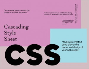
Chapter 2 was quite helpful unraveling the mystery of how most websites are creatively built with beautiful and intricate appearances. Developing and creating a single style sheet is definitely the most essential key to the internal world of creating a good looking website. Although there are a lot of rules to be remembered, the reading still helped me to understand the basic structures; as far as, how to use styles and style sheets. Creating an external style sheet seems very interesting because it does not contain any HTML so it is different compared to creating an internal style sheet where we need to have the <style> tag and always remember to close it at the end.
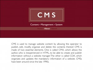
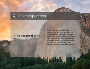
The term I have is CMS, because they are often used in websites, such as blogs and news. So for my typographic design, I decided to have a similar concept as if I was writing the definition in a blog. I created this compact blog theme by using Gill sans semi bold for the heading and light weight for the actual definition. The reason I chose this font is that it looks profound and “many consider it to be quintessential British type style” which can portray CMS in a very disciplined manner, while not lacking its own unique style.
