Type
Term | Type
Arvo is a slab-serif font created by Anton Koovit especially for Google Fonts. Arvo is just one of eight fonts that Koovit has created. Although, most commonly used as a header or sub-header, Arvo makes a very legible body font because it’s monolinear. As a header or sub-header, Arvo is noted to go well with a sans serif.
Reading | Chapter 7
As I was reading I really started to realize what I could do and what I really should not do. Just because I can add a decorative border – should I add a decorative border? Even giving an empty space the wrong color could really distract a reader. Leaving white space is beneficial. It gives the viewer room to breath. Adding effective padding is also key to a successful page. On the other hand, I think letting an image with large type (if any) take up the whole page with no margins could be really beautiful. 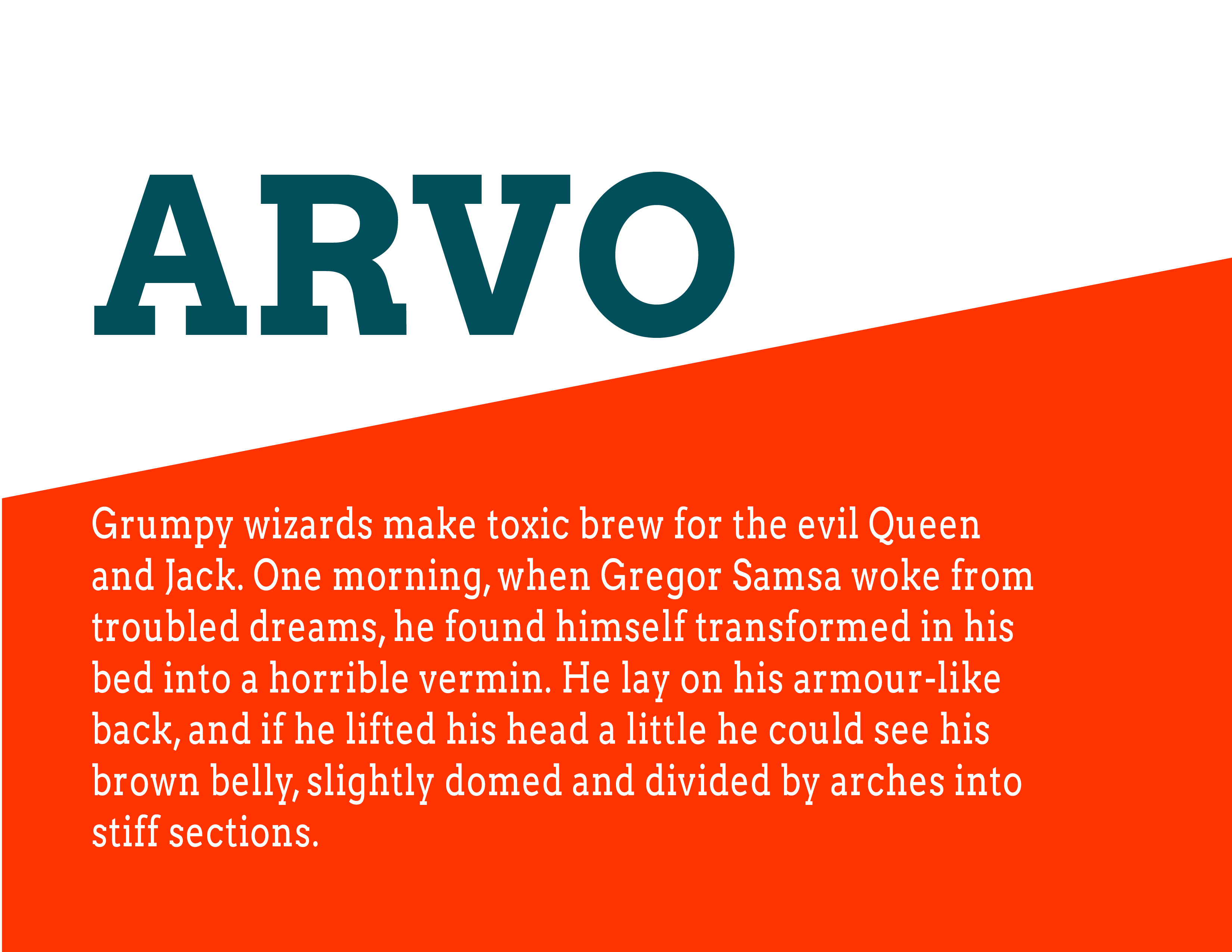
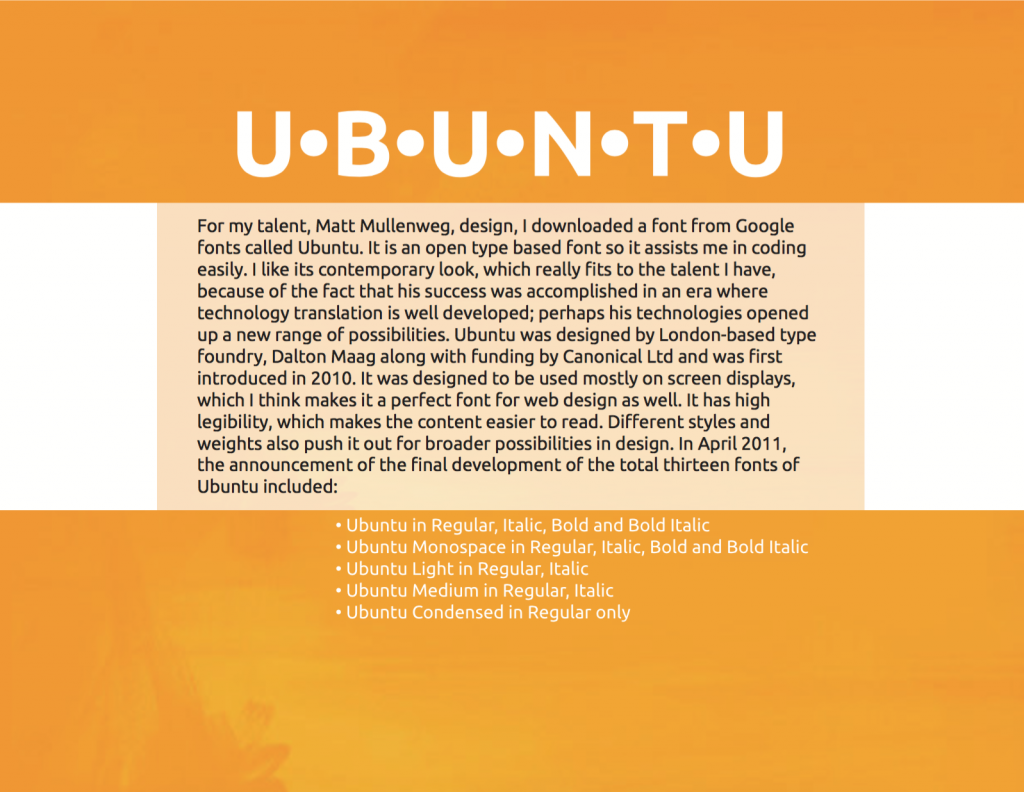
As I began revising and resetting my term/technology/talent pages into a wireframe, I changed the typeface from Avenir to Open Sans. The two are very similar, meaning I can replace all the old text I carefully set in Avenir with Open Sans and only have to do minimal adjusting. Open Sans is a google font, so it will be much more convenient to code with.
Open Sans was commissioned by Google in 2010 and designed by Steve Matteson, the Type Director of Ascender Corporation. It is a humanist sans-serif with 5 weight variations, each with its own italic. According to Google:
“Open Sans was designed with an upright stress, open forms and a neutral, yet friendly appearance. It was optimized for print, web, and mobile interfaces, and has excellent legibility characteristics in its letterforms.”

For this project, I felt that the concept of “Universal Type,” had to somehow incorporate the most ubiquitous font seen around the world, Helvetica. Helvetica is functional, utilitarian, and it seems to fit the theme. However, I feel that using Helvetica is too easy. It’s already familiar to a lot of people and it’s free in many of it’s forms. Helvetica may be one of the safest font choices. However, I want that sleek, sans-serif look that says, “I’m modern, I fit in just about everywhere and I know what I need to do.” How could I not choose Helvetica? How I actually use it will be another issue, but I found a similar font to complement this old classic.
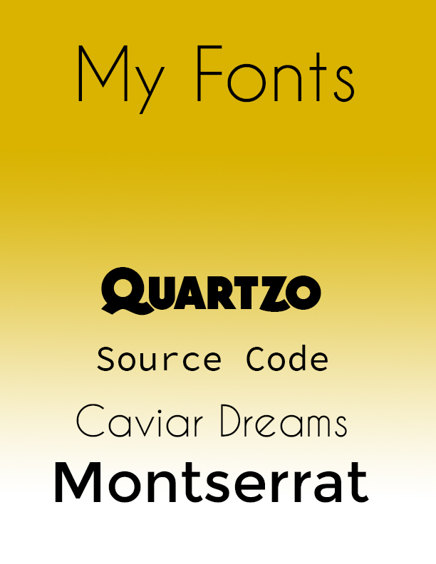
MontSerrat is a free web font accessible from Google Fonts. I chose this font because it shares enough of the sans-serif utility of Helvetica, but feels a little more unique. The fonts juxtaposed together bring out the weightier characters of MontSerrat and shows some further reductions in the letter form shapes. I think both fonts work as headlines and body copy, so I’ve elected to do more headlines with MontSerrat, and left the Universal Type headline in Helvetica.
Today we were given multiple lists of popular web fonts from 2015 and Colleen shared some great resources for displaying your type and choosing color palettes for coding. Finally, I thought that chapter 6 and onward of the CSS3 Missing Manual text is really helping me understand how to code these 24T assignments. I should be doing for Code Academy refreshers.
Snow day tomorrow?
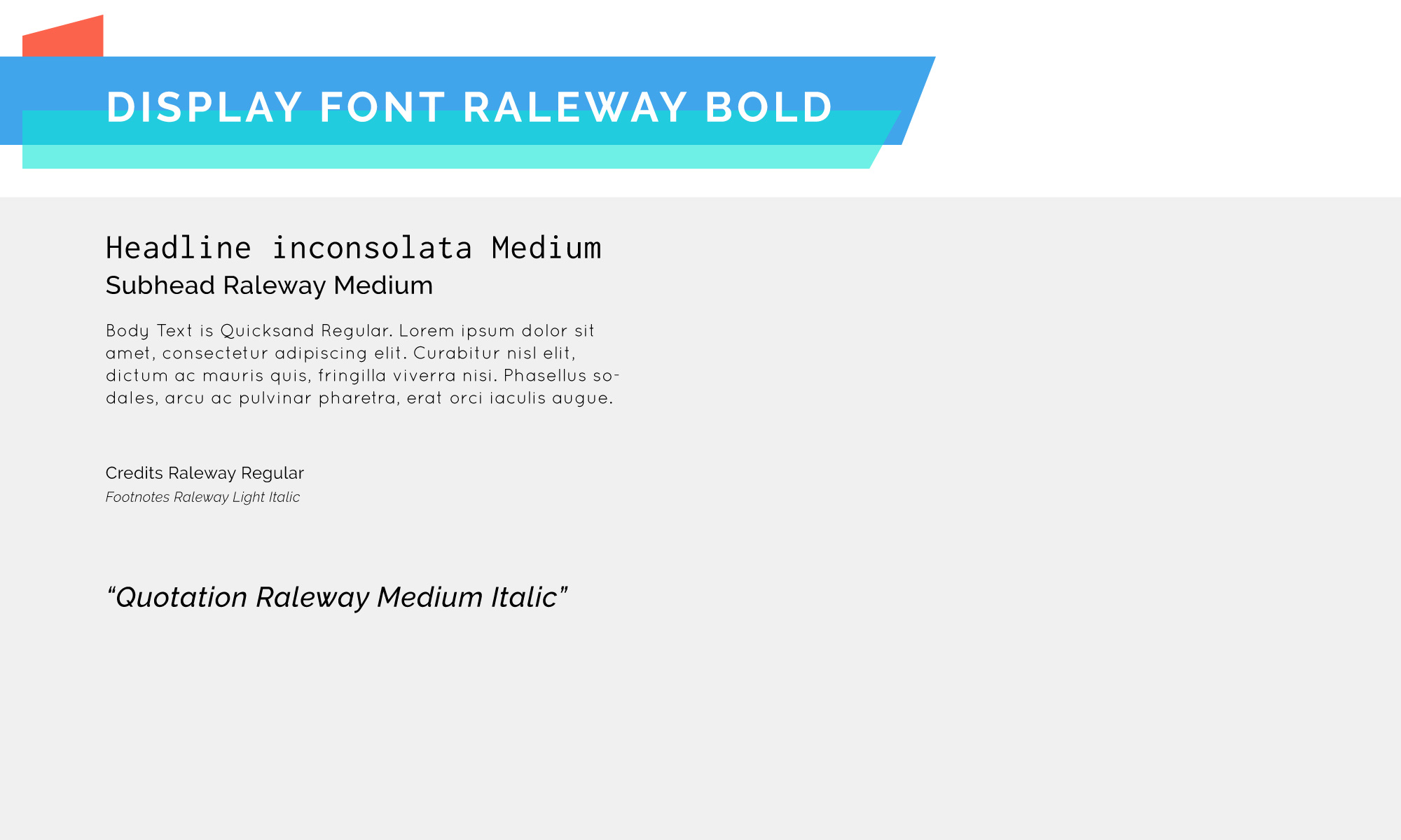
When setting type on your website, it’s good to know where you can get free fonts. Due to legal purposes many font companies prohibit the use of their font on your personal website. Therefor, when choosing a font to download from websites such as Google Fonts or Typekit, it may not be standard typefaces you’d normally find in your font-book that you can choose from, but there will always be a font so similar that the subtle differences cannot be noticed from a computer/mobile screen.
It is also nice to know what font-family (for example) to use as a headline or what font-family to use as a body. As a designer with previous experience in typography, I didn’t even know that sans serifs were preferred headline fonts. A sans serif is clean and therefor stands out because of how little it needs to fight for your attention. On the other hand, serif fonts, with their little feet, makes it easier for our eyes to follow, which makes it a preferred body font.
Today in class we went over several things that I had never used or heard of before. First we learned that what server is but I still feel kind of confused about what it truly is because I am a very visual learner. From my understanding a server retrieves and sends information back and forth, I just don’t understand where it’s sending to. We also discussed PHP and how this is open source and how PHP allows the server to create things on the fly.Then we looked at FTP or file transfer protocols which transport computer files from one host to another. In class we used Fetch as our FTP, and transferred our dreamweaver file using this. Lastly we talked about WYSIWG (what you see is what you get) and how dreamweaver functions like this.
