Aubrey Samson

Posted by | Aubrey Samson | No Comments

Responsive Type Presentation Responsive Type Presentation2 Responsive Type Presentation3 Responsive Type Presentation5 Responsive Type Presentation4 Responsive Type Presentation6 Responsive Type Presentation7 Responsive Type Presentation8 Responsive Type Presentation9 Responsive Type Presentation10

Mindcraft

The Collectors


Works Cited

webtypography.net

http://clearleft.com/

http://www.websitedimensions.com/#

http://www.creativebloq.com/css3/handling-typography-responsive-design-4122794

https://bugsnag.com/blog/responsive-typography-with-chained-media-queries


1/27/15 Blog Post

It was nice to get a little more practice in during our last class period, as i feel the more i do in dreamweaver the more i will understand. I think the adaptive qualities of code definitely comes in handy, but i’m starting to realize i will probably need to use this method for literally everything on the page, which in the end is an entirely new layer. I enjoyed the exercise we did, although i feel it will be a whole other story when i am sitting with a blank page in front of me and i have to build the code from the ground up. I am really going to have to understand how the system works in order to achieve “special” effects, like having the line run through the name rather than above it, etc. It seems like such a simple design quality, but you really have to know what you’re doing in order to “trick the system”. Coding is basically a big problem and you have to find the best and more efficient way to solve it. Excited to be more familiar with it an

webtypography.net

Posted by | Aubrey Samson, Technology | No Comments

1/25/16

Reading

After learning justttttt a little bit about coding, i started to play around a bit and was thinking to myself, how would i do this, or that? Theres gotta be an answer, but im such a noob! After reading chapter 3, one of my questions was answered. If i have a particular tag that has a certain css, and i need to have one of those tags have a different style, how would i approach this? The answer is class selectors! After doing the tutorial i still was a little confused on where to put the selector and so fourth, but i know with more practice it will click.

Throughout the chapter they also explained how the family tree works, and explained what ancestors, descendents, parents, children, and siblings refer to. This will be helpful when i am trying to build a descendent selector, because i will need to know what that specific tags ancestor is.


Technology

This technology, associated with the word responsive typography, translates a classic graphic design paramount into a new formula applied specifically for the web. The book “Elements of Typographic Style” originally written by Robert Bringhurst was applied to the web by UX designer Richard Rutter. This is a helpful tool for designers who are more knowledgable in print typography, using an classic that typically understood by designers today.

GRPH325_Samson_Aubrey_webtype

Richard Rutter

Posted by | Aubrey Samson, Talent | No Comments

Reading

Today we read about inheritance, and how using this concept (to achieve coherence in a design) can save us a lot of time and effort. It kind of goes with the whole family metaphor, certain tags will inheret properties of its ancestor. This can sometimes get you into trouble tho, and may not always work for your design. Use wisely!

Talent

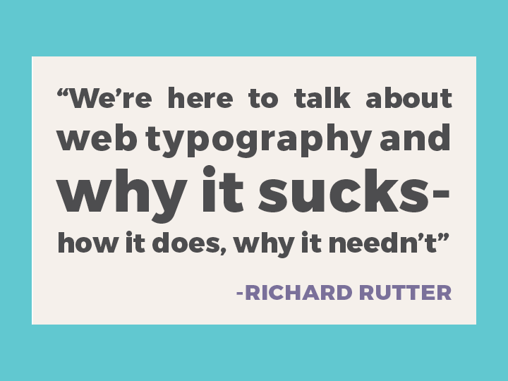
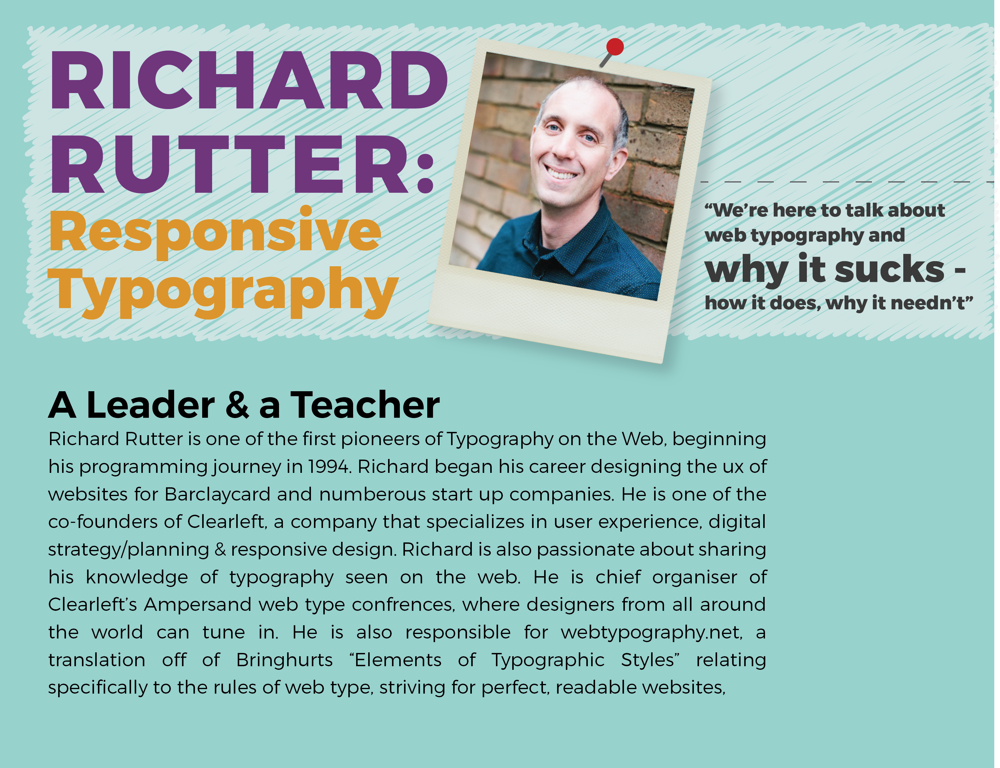
Typography is one of the most important elements on the web, it needs to be clear, readable, and approached differently than print typography. We talked about a couple of differences in between print typography and web typography in class. Richard Rutter, the talent assigned to me, is obsessed with the thought of typography, even more specifically, web typography. He is one of the pioneers of website design, and really understands what factors make successful web type. During his career, he has developed true methods to understanding and achieving better web typography, and he wants to share it with the world. He is the co-founder of a company called “Clearleft” which specializes in user experience and responsive design, using digital strategy and planning to consult and innovate groundbreaking products for their clients.

GRPH325_Samson_Aubrey_RichardRutter

See the website here

SSKrtEsm

Posted by | Aubrey Samson | No Comments

There are a lot of terms that comp up when discussing file types, servers, browsers, or just anything really related to what goes into making a website work and function. I literally feel like i’m learning a new language, and i’m sure it definitely could be argued that all of it is in fact a separate language! Especially html, and i believe they do refer to html vs javascript etc as languages. Even with just the little bit i have learned, i am already starting to notice more things when browsing through the computer, or even noticing people talk about these things on social media. Pretty soon i am hoping to be fluent in computer; I am excited to be more familiar with these terms.  A lot of acronyms are used I feel writing these terms down will help them stick.

PHP- Hypertext preprocessor. Basically it is the server side-scripting language, or code.

FTP- File transfer protocol. A program used in order to transfer files from the server to the person making the code (is what i understood, i think working with these programs will help me understand it better) We used the program “Fetch” in class

SQL- Structured query language used to communicate with the database.

WYSIQYG- What you see is what you get! This refers to when your working on a code on a program like dreamweaver, for example, you see the code youre working on but also can see how the final product will look. Dreamweaver has the options to see things in a split screen, displaying the code and the design of the website.


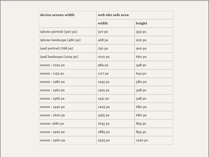
For my definition project i chose the term responsive typography, which refers to typography seen on a screen that changes in scale according to the size of the screen. I have experienced the downsides to this, when visiting a website on my computer then viewing the same site on my phone screen which is considerably smaller. The most successful websites employ responsive typography and function properly on all platforms; a computer, phone screen, and tablet.


GRPH325_Samson_Aubrey_ResponsiveType


Welcome Back!

Posted by | Aubrey Samson | No Comments

In response to the first day of classes;

I am increasingly excited to learn more about where the design world is headed, and to be more familiar about the possibilities of interaction design!

It is true that the internet is an increasingly important tool to not only designers but to the general public, considering how people can function. The internet allows people the opportunity to approach tasks more conveniently and faster than ever; the future of design is primarily interactive platforms that allow people to accomplish said tasks in an easy and understandable matter. I feel this class will allow me to think more critically about the functionality of such platforms for example what makes a website easy to navigate through and accomplish tasks.

Things i learned today…

  • CMS aka content management systems. This concept refers to a database that is used to store every piece of information that makes up a particular website. Now it is easier than ever to add and manipulate content quickly and efficiently to keep up the rapid pace of design.
  • Creating a category in order for a quick way to filter in and out of different areas of a site.

Things i’m looking forward to…

  • Learning the basics of coding! Being able to understand how to set up a completely unique website with the knowledge that i have acquired during the course.
  • Being able to set up my own website for my portfolio!
  • Thinking critically about target audience and design choices made for understandable navigation.