Collin Rasmussen

February 17, 2016

Posted by | Collin Rasmussen | No Comments

Class

Seeing everyones awesome sketches of wireframes for their navigation was very insightful. They all seemed very interactive and fun for the user. I took a different, more straight forward approach on my wireframes. I decided it was best to ditch my original thoughts and look for inspiration for a more interactive navigation menu. I came across this article and had so much fun playing around that it was a struggle to snap out of it and get back to work. Some of the best websites not only visually hook it’s viewer but will engage them with fun interactivity as well.

January 10, 2016

Posted by | Collin Rasmussen | No Comments

Although I haven’t learned exactly how to get certain effects for my website yet, I have finally understood a couple mile stones. Looking back on it, what I have learned thus far seems not as hard as I made it out to be, and I feel really dumb now. This makes me really hesitant to move forward, but I realize now that learning code is about taking things one step at a time.

I have figured out how to structure my html and style sheet and divide them into separate div’s, and within them, setting up titles, sub-titles and body paragraphs and ultimately how to style those. The next thing I want to learn how to work with are pseudo’s. I will eventually need this knowledge so I can set up more advanced operations because my design relies a lot on angles.

February 8, 2016

Posted by | Collin Rasmussen, Uncategorized | No Comments

When dealing with a problems that don’t quite click for me, it can be a good solution to just write it out by hand, take a step back and recognize how I get from point a. to point b.  That is why a couple of classmates and I did so on a large white board to figure out how to begin coding our page. There’s a lot I still need to learn, but at least I can now understand the basic fundamentals in creating a webpage.

It is also important to stay organized when coding. During the process of developing a webpage, I began with several files, which got a little busy. This was especially true with all the font files I needed for only three fonts. By splitting the overall project into four separate files (fonts, CSS, Images and HTML) I could stay organized enough to move through smoothly. However, another way to become evening more organized is through the coding process. It wasn’t until I started actually coding a project from basically scratch when I needed to turn to help. So, I turned to my roommate who has a lot of experience coding and he told me that a good way to get confused is by not organizing separate lines in your code. By just indenting each  line according to where it lies within each system, I was able to recognize my process better. It’s starting to make a lot of sense!

February 1, 2016

Posted by | Collin Rasmussen, Type | No Comments

Term | Type

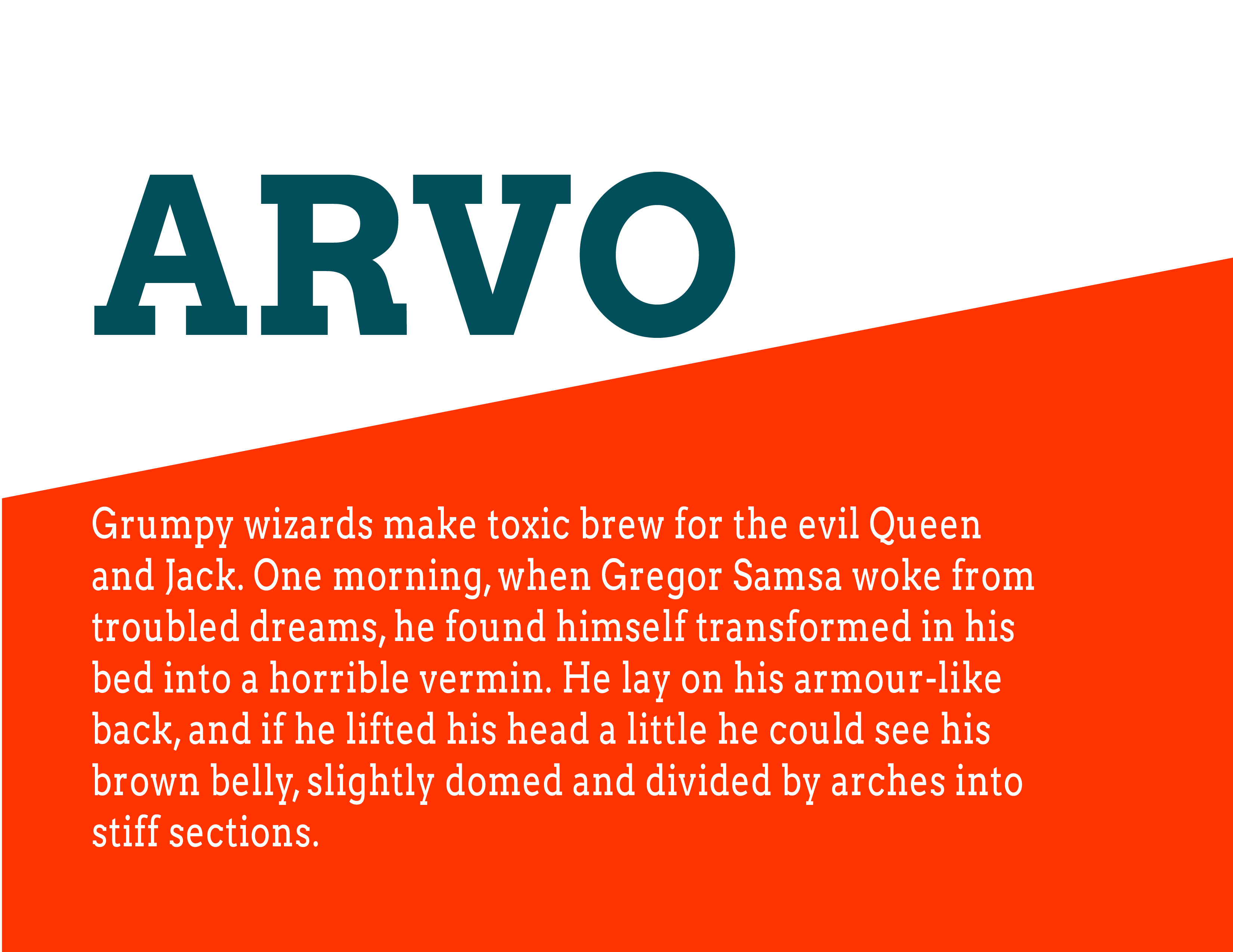
Arvo is a slab-serif font created by Anton Koovit especially for Google Fonts. Arvo is just one of eight fonts that Koovit has created. Although, most commonly used as a header or sub-header, Arvo makes a very legible body font because it’s monolinear. As a header or sub-header, Arvo is noted to go well with a sans serif. 

Reading | Chapter 7

As I was reading I really started to realize what I could do and what I really should not do. Just because I can add a decorative border – should I add a decorative border? Even giving an empty space the wrong color could really distract a reader. Leaving white space is beneficial. It gives the viewer room to breath. Adding effective padding is also key to a successful page. On the other hand, I think letting an image with large type (if any) take up the whole page with no margins could be really beautiful. Arvo_type

January 27, 2016

Posted by | Collin Rasmussen, Type | No Comments

When setting type on your website, it’s good to know where you can get free fonts. Due to legal purposes many font companies prohibit the use of their font on your personal website. Therefor, when choosing a font to download from websites such as Google Fonts or Typekit, it may not be standard typefaces you’d normally find in your font-book that you can choose from, but there will always be a font so similar that the subtle differences cannot be noticed from a computer/mobile screen.

It is also nice to know what font-family (for example) to use as a headline or what font-family to use as a body. As a designer with previous experience in typography, I didn’t even know that sans serifs were preferred headline fonts. A sans serif is clean and therefor stands out because of how little it needs to fight for your attention. On the other hand, serif fonts, with their little feet, makes it easier for our eyes to follow, which makes it a preferred body font.

January 25, 2016

Posted by | Collin Rasmussen, Talent | No Comments

Reading

The letter “C” in CSS stands for “cascade”, but what does that mean? Well, technically it means – a process whereby something, typically information or knowledge, is successively passed on, but in programming it is so much more. Cascade relates directly to style sheets and is necessary when style conflicts happen. Style conflicts can either happen through inheritance or when one or more styles apply to the same element. Basically it’s a set of rules for organization purposes so style properties get assigned properly. Using a clean slate could (without cascade) could get tiring and long.

Talent | Luke Wroblewski

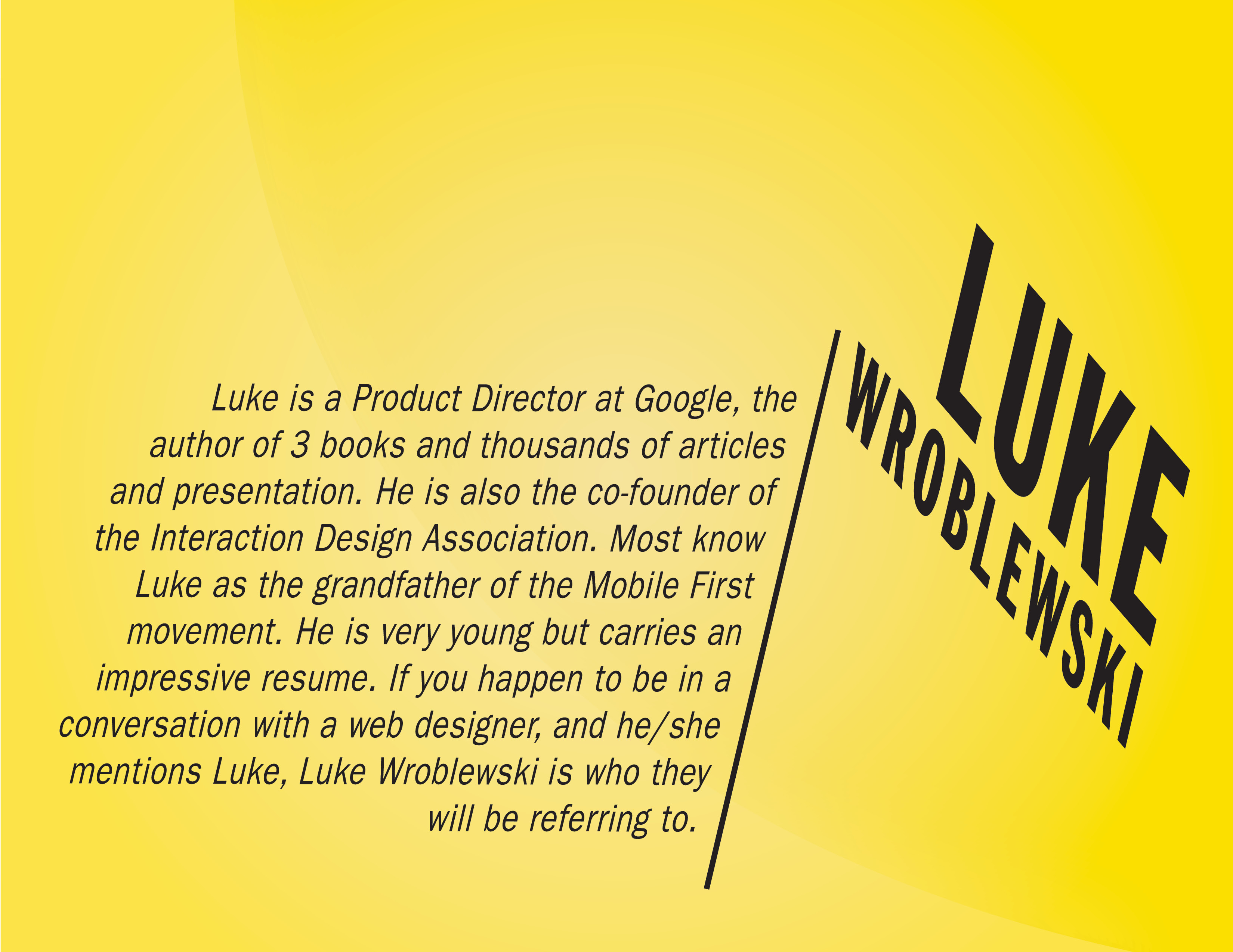
Luke is a Product Director at Google, the author of 3 books and thousands of articles and presentation. He is also the co-founder of the Interaction Design Association. Most know Luke as the grandfather of the Mobile First movement. His website Lukew.com offers great lessons to inspiring guru programmers like himself. He is very young but carries an impressive resume. If you happen to be in a conversation with a web designer, and he/she mentions Luke, Luke Wroblewski is who they will be referring to. 

wroblewski

January 20, 2016

Posted by | Collin Rasmussen, Technology | No Comments

Technology

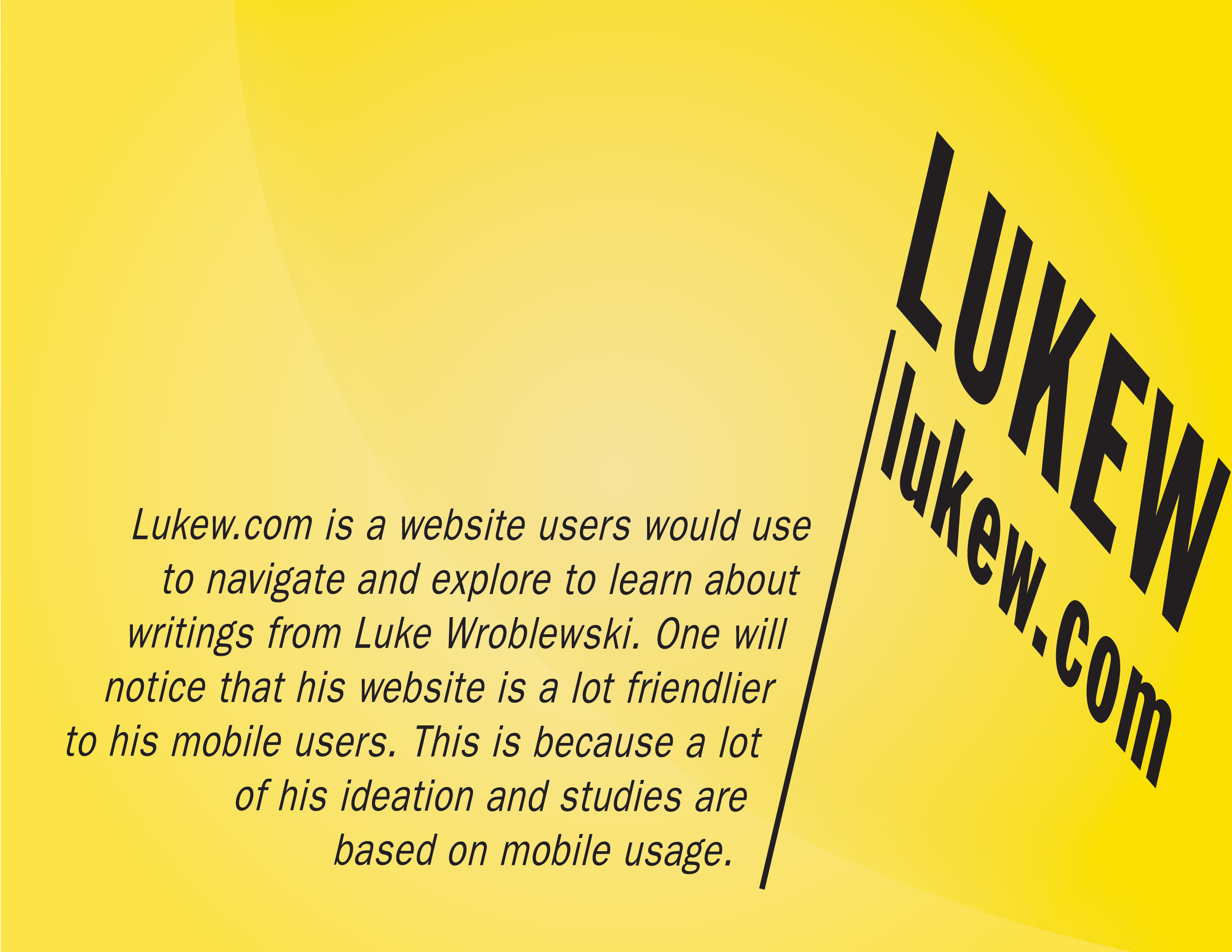
Lukew.com is a website users would use to navigate and explore to learn about writings from Luke Wroblewski. Luke is an Interface Designer who focuses mostly on Mobile First (a strategy Luke uses and advises using when programming web pages), Web Form Design and Web Usability. He seems to have taken a more revolutionary approach to programming and web designing which has lead him to many accomplishments.

He uses large collections of data to help other programmers and designers improve. A recent study by Luke has revealed that as mobile screens sizes increase… so does activity. It’s important to consider usage on different size phones/tablets. Learn more for yourself at Lukew.com!

Screenshot_01

screenshot_02

lukew

January 13th, 2016

Posted by | Collin Rasmussen, Terms | No Comments

Chapter 02 | Creating Styles and Style Sheets

Styles can get really big and confusing, cause frustration, and may be the reason you’re buying a new laptop. That is why a bunch of smart people built little systems to make them easier to read. Styles are necessary CSS codes when adjusting anything from the color of the header to the size of the paragraph’s type. When you complete a sheet full of codes, you got yourself a style sheet. There are two types of these – External and Internal. When you want an easier way to build your website or if you want to update your website faster, it would be smart to go with an External style sheet. Internal style sheets are less efficient, however they do make adding a webpage easy.

Class Work

Learning how to code using the Code Academy will be something I have always wanted to do, but just could not find the time to do. As I start of learning the basics I find it relaxing and, in a way, mindless. I definitely love to design hands on a lot better but I am excited to see what neat tricks I can learn along the way.

Research | Mobile First

Mobile first, according to Luke Wroblewski, is “a way to start thinking about building web products and services in the context of what’s going on today with people’s behaviors and digital products in general”. Whether you want to build a mobile platform or not, it makes sense to build a mobile version first even if you do not end up launching it. Use this advice not only because your competition will (growth = opportunity), but because you can bring these files back to your desktop to begin with web development. Wroblewski (co-founder of mobile first) stress’s that while beginning with the constraints of a mobile platform, you will be forced to focus harder because of the small screens and slow connections. There are lots of new and fun capabilities to play around with in mobile that have not hit the desktops yet. Overall when thinking mobile first you must keep in mind things like multiple screen sizes, or device capabilities. After studying in depth, mathematical and scientific solutions and applying this to your product, you could feature advanced works and present an impressive development.

Video: Mobile First! 
mobile_first


January 11th, 2016

Posted by | Collin Rasmussen | No Comments

Ah, a new semester and the next chapter in the development of my designer skill set. Only this chapter starts with this (my very first) blog post. Here we go!

Excited as I am to begin learning how to program a website, I am nervous because I know how important this opportunity is. Graphic design may be a broad field of practice, but almost no one, in todays society, will give me the time of day without at least a beginners knowledge in programing. So, why not learn it just in case – right?

Luckily I get to start by using technology that allows faster and easier control over my database. This technology is called the content management system (CMS). What I will be focusing on is CSS. Cascading style sheets (CSS) is a different language than HTML and focuses more on the aesthetic of the web page. It’s only getting easier and easier but we still have a long way to go.

Cheers to what’s to come.