Leah Urbank

3.16.16

Posted by | Leah Urbank | No Comments

Reading

Chapter 15

I discovered the three positions used in CSS coding. I’ll admit to fumbling in the dark for the most part with the first project.

Relative – The element would appear relative to where it would normally appear. So if I were to put a top value of 300px, that element would show up 300px below the default position from the html.

Absolute – This seems a little tricky, as you are specifying exactly where things are placed, so using it runs the risk of disappearing or ending up in some weird ass place. HTML doesn’t even know what to do with this bullshit, so it’s really detached and does whatever the hell it wants.

Fixed – A fixed thing stays exactly where you put it. You scroll, and that shit ain’t goin’ nowhere.

Static – The normal thing. I probably won’t ever use this, because it’s the normal top-down scrolling and stuff like that.

I’m so happy that the book uses a plethora of images to teach me how all of these things work. I might have to print them, cut them out, and then paste them all over my walls like a madman.

3.14.16

Posted by | Leah Urbank | No Comments

Reading

Chapter 14

This is where we start getting into responsive web design.

We’ve talked about it as a class before, with each screen in the world pretty much being it’s own unique size, but we finally start getting into the nitty gritty of actually making the website do what you want it to. Media Queries are CSS3 coding that let’s me assign styles to a page based on the destination browser’s width and height.

There are many different ways of actually achieving this, but i really prefer stacking things and reducing the columns so the page scrolls continuously rather than stripping content or just making this smaller.

Although, it makes me sad to know that the background images won’t shrink down, rather you have to have in image that is smaller. So if you had a large banner on the top, the mobile user isn’t gonna zoom out to see that, rather you have to code in a background image that’s going to fit.

Breakpoints remind me of like a page break on a paper. It’s essentially a cutoff point for things to change. So if I had a screen no larger than 520 pixels, it would automatically choose the smaller design, rather than the larger that wouldn’t fit.

3.7.16

Posted by | Leah Urbank | No Comments

Reading

Chapter 13

I’m having a really hard time understanding the concept of a float and how it works. In the words of the W3 school, the float function makes words and other content wrap around other content. For example, words that should wrap around an image, rather than ignore its dimensions.

The chapter is taking that to the next level, and making an entire website layout using floats and how they interact with one another. It make sense knowing that the float command only accepts, left, right, and center, so it makes the organization of this much easier.

I’ll admit to getting lost when we start putting floats within floats, though the images and diagrams that the chapter actually provides are really helpful.

Class

For this class session, I had my basic wireframes due, as well as the brief for the new continuous, narrative driven project. I want to keep it simple, as well as informative. I want this to be something that people like me would continually come back to as a resource, and something that that would be easy to go through for someone who wants to do this on their own.

3.3.16

Posted by | Leah Urbank | No Comments

Class

After finishing up the last of the previous project’s critiques, I got the chance to go through through the animation tutorial in the manual. Although the tutorial itself was very fun, I don’t know exactly how helpful it’s going to be, because the resulting animation wasn’t over complicated.

After the introduction of the newest project, I felt myself floundering for a topic, but I eventually went with the idea of a complete resource for those who want to dye their hair with semi-permanent brightly colored hair dye. I want this to be a one-stop place for people.

I also want the website to be able to essentially be able to sample hair colors and their combinations so that they would be able to see what colors would look like on different colored hair, but I don’t know how to create a menu or box that is interactive like that.

Although, for my brief, I have decided on a general color palette:

Project3_Palette2

3.1.16

Posted by | Leah Urbank | No Comments

Class

In class on Monday, we finally critiqued our navigation systems. While it took the class an the entire time and more, the critiques I were given were good.

The changes that were suggested to me are the following:

  • To change and make the background shift in the actual website, rather than keeping in the one flat gray that it was. The tiles themselves are rather simple, as is the functionality, so it would be nice to have some variety in other aspects.
  • The icon color that I used for the 3T is the same as the other tiles that I use throughout the website. To separate them more, it would be good to change the color the the title tile.
  • Also, now that the app design is more interesting, and is more like a game, the desktop functionality and design feels rather stale and boring in comparison. I would have to change and redesign the desktop capabilities so they are more fun and interesting. I don’t know how exactly I’ll do that, but the advise s good and I see the truth in it.

Reading

The tutorial for the reading really actually helped this time around. For project 3, I want to have a navigation bar on the top horizontally, going through the motions of actually getting a horizontal bar to work really helped. There were more steps than I expected, but I’m glad we got to do it.

2.24.16

Posted by | Leah Urbank | No Comments

Starting the actual documentation homework was quite the struggle. Using Behance was an invaluable resource, as there was a wide range of interaction design works the reference/copy. I wanted something I was proud of, and I gradually put together something that I liked.

The overall project, while not difficult, made me consider how the mobile app would behave way more than the wireframe did. In the wireframe, I didn’t even think about how small the screen was, and how the functionality of the navigation system would have to be completely restructured.

I had to completely collapse everything down in order to make it intuitive and understandable on the mobile version, but also for the text to still be readable. Things still had to be easily to read, but also easy to poke with a fat finger.

Project2_PresiAlone

2.22.16

Posted by | Leah Urbank | No Comments

Class

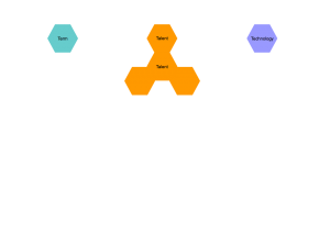
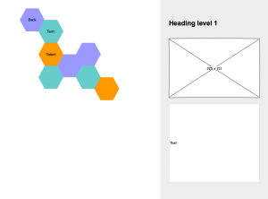
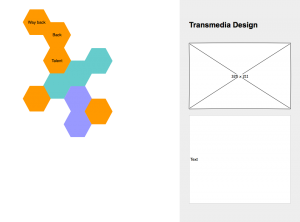
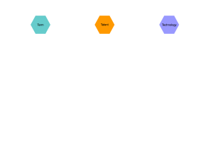
In class, we looked over our rough sketches/wireframes for our new navigation systems. I’ve chosen to do a hexagon based system, that folds out and expands based on what has been clicked.

homepage orangedropdown page1 page2

Working through the wireframe and into the small presentation really makes me believe that this system is workable, and could be coded into a fun, functional navigation system.

Each category would be color coded, and you could access it pretty easily. Working through making the small presentation thing for the following Monday really made me think about how this would function and how it would behave under certain sizes and conditions. It also made me think about how all of our terms, technologies, and people link together in the world of interaction design.

Also, I download an actual wireframe software called Pencil, which is a open-source, easy to use free software that I used for this assignment. I had tried to use an online one so I could actually link things together and see how they worked, but the lack of hexagons was really limiting.

2.17.15

Posted by | Leah Urbank | No Comments

Class

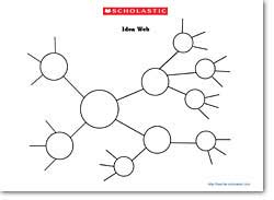
Looking at the different ideas for navigational systems in class was fun. Everyone as their own thought process, and seeing the different structures of those thoughts on paper is interesting. I think I came to the ultimate conclusion that I hate the spiderweb navigation systems. They’re ugly, and I don’t like them. It doesn’t adhere to a grid, so it seems to come off as having no structure. The more basic ones, like below, bother me the most, because they don’t have any kind of designed element to them, other than the ability to make a circle. They don’t look considered, and that really bothers me.

lessonplans_graphicorg_images_ideaweb

See? Ugly.

I admit, I did get caught in the animation and how the navigational system would behave, rather than the menus themselves and what information it would display. We’ll do this wireframe, and see how this works out.

2.15.16

Posted by | Leah Urbank | No Comments

Reading

This chapter was about links, and it was nice to see the pseudo classes involved with the links and their different set of existences.

nav a { font-family: Arial, sans-serif; }

nav a:link { color: #F60; }

nav a:visited { color: #900; }

nav a:hover { color: #F33; }

nav a:active {color: #B2F511; }

I have already done some basic link editing with my typesetting with the terms and whatnot. I can remove the underline with a style: none;, but it’s nice to actually see the different effects and how the would behave.

For the navigation bars, while I have nothing like that in the website I’m already working on, it’s nice to build on the html that I already know. I still go through the lessons on Codecademy, and I’ve been thought he lessons about lists, both ordered and unordered. Overall, the setup of navigation bars makes a lot of sense, but I don’t know how much of the detail is going to stick in my brain, so I’m going to be referring to my notes often.


2.10.16

Posted by | Leah Urbank | No Comments

Class

Now that we’ve worked on the website and subsequently got really frustrated on it, I feel like I’ve really grasped some of the more basic concepts of coding. The containers and how they layered into one another really threw me off, because I couldn’t understand all the different borders how they actually contained stuff. Now that I’ve fiddled with it for some time and with the help from Colleen, it clicked in my brain.

Reading

This was a reading about links, and that covers buttons as well as designing the actual links themselves.

I did the most basic of these functions without reading this section, as I just changed the color of the link and took away the underline. I really forgot about all the different levels of activity of links, and so it was nice to be reintroduced to the concepts. While I don’t think my own website will have any buttons at this time, it’s quite a lot to try to remember.

The parts about the navigation bars were really interesting, as its a very basic concept that a lot of websites have, but its actually very complicated. I understand the styling and how it’s done, but I would like to do the actual tutorial, so it really settles in my brain.