Michael Johnson

2/29

Posted by | Michael Johnson | No Comments

As I began revising and resetting my term/technology/talent pages into a wireframe, I changed the typeface from Avenir to Open Sans. The two are very similar, meaning I can replace all the old text I carefully set in Avenir with Open Sans and only have to do minimal adjusting. Open Sans is a google font, so it will be much more convenient to code with.

Open Sans was commissioned by Google in 2010 and designed by Steve Matteson, the Type Director of Ascender Corporation. It is a humanist sans-serif with 5 weight variations, each with its own italic. According to Google:

“Open Sans was designed with an upright stress, open forms and a neutral, yet friendly appearance. It was optimized for print, web, and mobile interfaces, and has excellent legibility characteristics in its letterforms.”
2/25

Posted by | Michael Johnson | No Comments

I worked on revising my design for the web pages. I focused on what I’d seen and heard in crit. I focused on alternating the color of my pages to differentiate slides. I experimented with using another font, but I like the consistency that using Open Sans for all the text gives me. It has so many different weights theres really not need to use another typeface. I also checked everything for overall grid consistency.

2/22

Posted by | Michael Johnson | No Comments

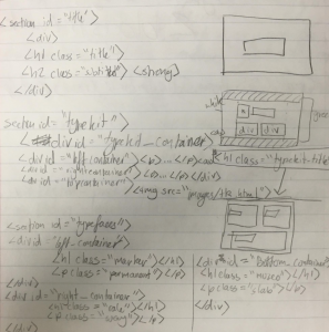
The exercise we did in class where we worked in groups to design a barebones html skeleton was very helpful. I feel like Im finally starting to understand how to put this website together. I found that writing my mock up on paper before I started coding it on html was especially helpful, as was sketching out my web pages

Screen Shot 2016-02-16 at 7.39.48 PM

2/17

Posted by | Michael Johnson | No Comments

We’ve now started coding our websites in class using the html skeleton that we developed for homework. It’s slow but rewarding. Progress is still very confusing, but I’ve made steps forward during class. I still have a lot of questions about how everything will work. Specifically about inserting images, and how I’ll be able to code the complicated boxes that I set more than half my text in on my pages. I also need to work on my typography page. I’m happy with where the design of all my other pages is, but the typography section is really basic and needs to be redone. Hopefully I’ll have time to work on this over the weekend.

2/15

Posted by | Michael Johnson | No Comments

Today in class we took a test on all the terms, talents, and technologies that we’ve been assigned to learn about. It was set up different than any test I’ve ever taken before, but it was to make us start thinking about different systems of arranging information. Our homework is to develop three different methods of organizational hierarchy for our and our classmates’s terms, talents, and technologies.

2/10

Posted by | Michael Johnson | No Comments

We’ve now started coding our websites in class using the html skeleton that we developed for homework. It’s slow but rewarding. Progress is still very confusing, but I’ve made steps forward during class. I still have a lot of questions about how everything will work. Specifically about inserting images, and how I’ll be able to code the complicated boxes that I set more than half my text in on my pages. I also need to work on my typography page. I’m happy with where the design of all my other pages is, but the typography section is really basic and needs to be redone. Hopefully I’ll have time to work on this over the weekend.

2/8

Posted by | Michael Johnson | No Comments

The exercise we did in class where we worked in groups to design a barebones html skeleton was very helpful. I feel like Im finally starting to understand how to put this website together. I found that writing my mock up on paper before I started coding it on html was especially helpful, as was sketching out my web pages

Screen Shot 2016-02-16 at 7.39.48 PM

2/3

Posted by | Michael Johnson | No Comments

I worked on revising my design for the web pages. I focused on what I’d seen and heard in crit. I focused on alternating the color of my pages to differentiate slides. I experimented with using another font, but I like the consistency that using Open Sans for all the text gives me. It has so many different weights theres really not need to use another typeface. I also checked everything for overall grid consistency.

2-1 Typeface: Open Sans

Posted by | Michael Johnson, Type | No Comments

As I began revising and resetting my term/technology/talent pages into a wireframe, I changed the typeface from Avenir to Open Sans. The two are very similar, meaning I can replace all the old text I carefully set in Avenir with Open Sans and only have to do minimal adjusting. Open Sans is a google font, so it will be much more convenient to code with.

Open Sans was commissioned by Google in 2010 and designed by Steve Matteson, the Type Director of Ascender Corporation. It is a humanist sans-serif with 5 weight variations, each with its own italic. According to Google:

“Open Sans was designed with an upright stress, open forms and a neutral, yet friendly appearance. It was optimized for print, web, and mobile interfaces, and has excellent legibility characteristics in its letterforms.”


1-28 Web vs Print Typography

Posted by | Michael Johnson | No Comments

Creating typography and design for print is not the same as creating it for a digital device with a screen. There are some key differences you need to keep in mind.

  • A screen is backlit
    • can affect visibility of text or strain readers eyes
  • Color variation from device to device
  • Relationship of screen size and magnifying options to text size and resolution
  • Interactivity (links)
  • Harder to read type on a screen
  • Shows differently on each screen/platform
  • Internet connection

Specifically, when thinking about fonts and typography on a screen, some things that will make your text much more legible are:

  • Higher x-height
  • Greater apertures
  • Slightly looser letter spacing
  • Generous bowl shape
  • Clear shoulders
  • Clear ascenders and descenders

A great resource as you move forward is The Elements of Typographic Style Applied to the Web. It’s essentially the web typographer’s bible and can be found here!