So this is the navigation I finished with, its a lot more complex and from crit, I learned I need to expand more on it and explain better detail on how it actually works. But I am really pleased on how complex this navigation is, if it would work.

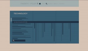
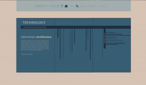
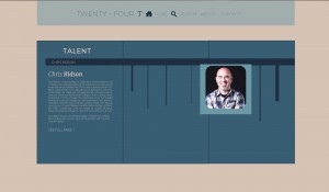
So this is the navigation I finished with, its a lot more complex and from crit, I learned I need to expand more on it and explain better detail on how it actually works. But I am really pleased on how complex this navigation is, if it would work.


First go around for Navigation:







I’m not quite sure if I like the navigation, nor if it makes sense so I’m going to re-look at it before the final ones are due. Class is starting to get on a difficult level for me so I think I have to bring it down a few notches.
First Idea for a Navigation pages. I created a title page that I really graphically enjoyed, I’m going to expand on this later to create my Navigation. I decided to name it “twenty-four T”. I think i’m going to connect it to the style of our first type assignment with color and using the same fonts. I’ve had an assignment to create a mock up of a website/nav page before so I think it will go well for me.

Starting to think about Navigation systems. ! The readings were pretty difficult and it seems like a lot to get into at first, considering I’m just now making sense of coding basic webpages. I’ve started to draw up some ideas for a navigation page.
The readings started off not helpful at all, but I’ve found myself finally understanding them (but slowly). I re looked at some of the chapters we started with and I’ve found that a lot more makes sense. The labs in class we’ve been doing are also helpful as well. Everything is slowly starting to come together for the good.
I haven’t completely given up on the our type pages, and I got pretty far which is awesome. But at the same time its so time consuming, I never really know what to work on. It feels I have put so much time into coding these pages, but it doesn’t show. When coding my pages I started with my background colors and sections. Mine were pretty easy because they worked well off the CSS we started with. After I had made the backgrounds I went in to change my fonts and colors of my fonts. This part was difficult to name. If anything has been hard its been the actual organization of my files and naming different areas in the CSS and HTML.
Overall I am pretty pleased with how far I have come with my webpages.
Chapter 8 Reading! What I’ve learned: All about adding graphics to web pages.
You can work with graphics in CSS with two different ways: the <img> tag and the background-image property. CSS properties that are usually used with images include: Borders, paddings, float, margins
When using background image, it can come from the web, or your file folder on your hard drive. There are many different URL types it can use some of them include: absolute path, root-relative path, document-relative path.
Repetition will automatically occur when using the background image property. You must always use the repeat property to specify how you want it to look. There are three different repeat types: no-repeat, repeat-x, and repeat-y. You can use keywords, Precise Values, and Percentage Values to position background images as well.
Another common background choice are gradients. Example of gradient: background-image: linear-gradient(left,black,white); of course you can use actual values for color and position. You can add as many colors as you like.
I’ve just realized learning CSS is alot of bullshitting. Like I have no idea what I’m doing so i’m just gonna move shit around and delete random stuff until it works.
….But at the same time it KINDA makes sense. I’m also starting to get the hang of dreamweaver and how to set up files and link style sheets to your HTML file. I finally understand the basics so the more advanced readings were doing slightly confuse me. I just would love to take a class on the intro to HTML to understand how to do everything.
Chapter 7 Reading! all about margins, padding and borders.
Padding- is the space between the content and the content’s border, Padding is what separates a photo from the border that frames the photo
Border- is the line that’s drawn around each edge of the box. You can have a border around all four sides, on just a single side, or any combination of sides
Background-color-fills the space inside the border, including the padding area
Margin- is what separates one tag from another. The space that commonly appears between the tops and bottoms of paragraphs of text on a web page, for example is the margin.
Paddings and Margins work pretty much the same, but a border makes all the difference. Padding adds space between the content and the border, and keeps the content from appearing cramped. Margins add white space (gutter) between elements. Pixels and ems are used to set the size of the margins and paddings.
A shortcut for doing margins and paddings is using TRBL, (top, right, bottom, left)
Also, there are so many different ways to do borders on your webpages I learned. Creating round corners is also a new thing I learned, Using the “border-radius” tag you can get your corners as round as you want them.
For box-shadows: the first value is a horizontal offset, the second value is the vertical offset, and the third value is the radius of the shadow (how blurry it is.)
I think I’m starting to get a good idea of coding…
Chapter 6 Reading: All about fonts!!
Web fonts are fonts that the browser downloads and uses while viewing your site. They use the font-family property but also use CC command called @font-face directive which instructs a web browser to download the specified font.
When choosing a font, you must order it in case someones computer does not have that font on there, also, if it has more than one word you enclose it in Quotations. When you don’t use webfonts, you are pretty limited to the basics which isn’t fun. Every updated browser now uses webfonts. There are different font types, and some of them work in different browsers.
EOT- Embedded Open Type, only works in Internet Explorer
True Type & Open Type-Most commonly used for computer fonts. Has wide support from almost every browser.
WOFF- Web Open Font Format-newer font format that’s designed specifically for the Web, compressed version of TrueType or OpenType, also has wide range of browsers that it works on.
SVG- Scalable Vector Graphic-It basically sucks. List of Free Web Fonts: leagueofmoveabletype, fontex.org, openfontlibrary, fontsquirrel, googlefonts.
Chapter 5 is all about managing multiple style sheets and how they collide a.k.a the cascade.
Cascade basically is the control room for style sheets that may come in conflict with one another, there are two different kinds of scenarios that control if a cascade needs to happen: through inheritance and when one or more styles are used for the same elements.
There are some basic rules for how the cascade works:
In this chapter these rules are explained on how a browser reads styles and tags when there are multiple ones applied to same elements. One f the most interesting things I read about in this chapter was how CSS determines which style wins. With a point system. It’s pretty amazing learning how complex CSS is. A tag selector is worth 1 point, class selector is worth 10, ID selector worth 100 points, Inline Style is worth 1,000 points.
If two styles tie, the last one wins because it appears first to the browser? If i’m understanding that aspect correctly.
Most web designers don’t use ID selectors because of how powerful thy are.
On another note, this book is still confusing as hell to me. I think I finally understand chapter 1 and i’ve just finished reading chapter 5…I’ve decided I do not like how this book is written. Uses too many “what if scenarios” “maybe you do this” and “this happens when you do this” and then I get confused to what in the hell i’m reading because of all these made up situations.